Energy Essentials
Overview
Energy. What do we really know about it? Where does the energy we use come from? How does energy flow through the systems of our planet? How is our energy consumption changing our climate? Who uses the most energy?
In celebration of Earth Science Week's 2010 theme, Exploring Energy, NASA presents a multimedia gallery that helps answer some of these questions. The images, data visualizations, animations and videos in this gallery highlight how NASA satellite data and research help us better understand how much is reaching Earth from the Sun, how it's distributed across the Earth, where humans are tapping into that energy, and the many ways in which our energy use is transforming our planet.
You can download the imagery in a variety of formats directly from this site. For more multimedia resources on energy and other topics, search the Scientific Visualization Studio. To learn more about Earth Science Week 2010, visit the Earth Science Week web site.
Energy Everywhere
Energy drives everything from from local weather on the scale of hours to days, to global climate on the scale of years to decades. It fuels the growth of plants on land and powers currents in the ocean. This section looks at some of the ways we can use, study, and understand the energy all around us on Earth.
Electromagnetic Spectrum
Go to this pageThis animation shows a graphical representation of the electromagnetic spectrum and includes - Radio Waves, Infrared, Visible, Ultraviolet, X-Rays and Gamma Rays ||
Ice Albedo: Bright White Reflects Light
Go to this pageThis animation provides a close perspective of the relationship between ice and solar reflectivity. As glaciers, the polar caps, and icebergs (shown here) melt, less sunlight gets reflected into space. Instead, the oceans and land absorb the light, thus raising the overall temperature and adding energy to a vicious circle. ||
Remote Sensing Conceptual Animation
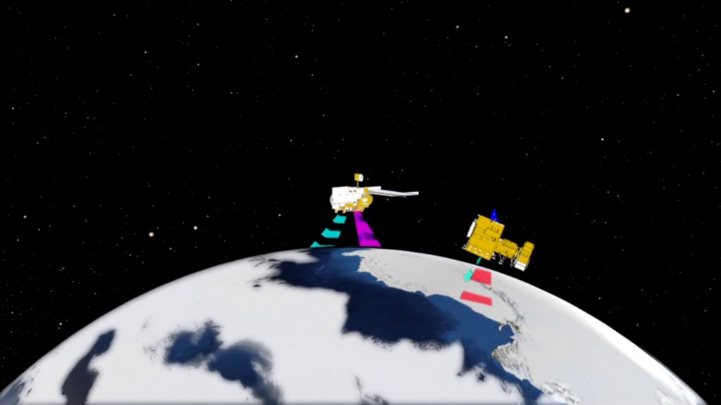
Go to this pageSatellite remote sensing is a tool for gathering information, usually about what is at the surface of Earth or planets and their moons, but also about the atmosphere. Remote sensing data are commonly combined with other kinds of data (typically, from field or "on-the-spot" studies [commonly called ground truth]) to act together as a system (for example, Geographic Information Systems, or GIS. ||
Hurricanes as Heat Engines
Go to this pageSee Conceptual Image Lab animation #10049 for additional Hurricane Heat Engines material. ||
A Tour of the Water Cycle
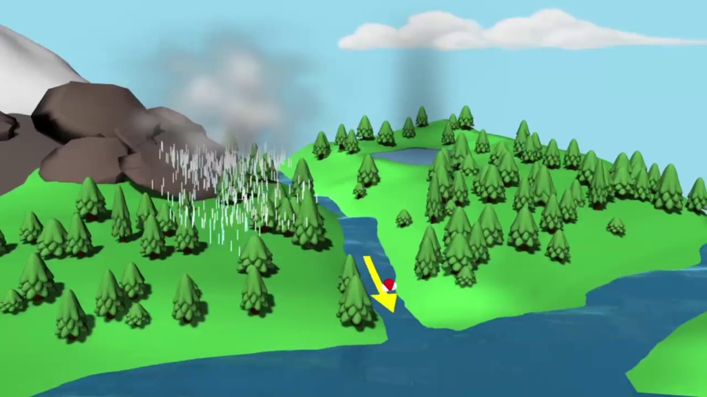
Go to this pageThis animation shows one molecule of water completing the hydrologic cycle. Heat from the sun causes the molecule to evaporate from the ocean's surface. Once it evaporates, it is transported high in the atmosphere and condenses to form clouds. Clouds can move great distances and eventually the water molecule will fall as rain or snow. Ultimately, the water molecule arrives back where it started...at the ocean. ||
The Carbon Cycle
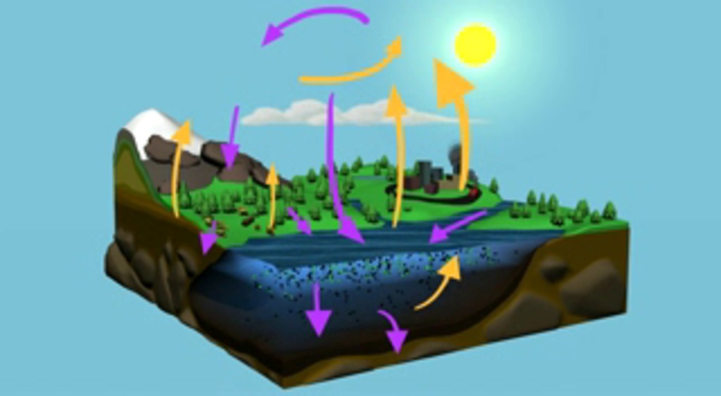
Go to this pageCarbon is the basic building block of life, and these unique atoms are found everywhere on Earth. Carbon makes up Earth's plants and animals, and is also stored in the ocean, the atmosphere, and the crust of the planet. A carbon atom could spend millions of years moving through Earth in a complex cycle. This conceptual animation provides an illustration of the various parts of the Carbon cycle. Purple arrows indicate the uptake of Carbon; yellow arrows indicate the release of Carbon. On land, plants remove carbon from the atmosphere through photosynthesis. Animals eat plants and either breath out the carbon, or it moves up the food chain. When plants and animals die and decay, they transfer carbon back to the soil. Moving offshore, the ocean takes up carbon through physical and biological processes. At the ocean's surface, carbon dioxide from the atmosphere dissolves into the water. Tiny marine plants called phytoplankton use this carbon dioxide for photosynthesis. Phytoplankton are the base of the marine food web. After animals eat the plants, they breathe out the carbon or pass it up the food chain. Sometimes phytoplankton die, decompose, and are recycled in the surface waters. Phytoplankton can also sink to the bottom of the ocean, where they become buried in marine sediment. Over long time scales, this process has made the ocean floor the largest reservoir of carbon on the planet. In a process called upwelling, currents bring cold water containing carbon up to the surface. As the water warms, the carbon is then be released as a gas back into the atmosphere, continuing the carbon cycle. Carbon is found in the atmosphere as Carbon dioxide, which is a greenhouse gas. Greenhouse gases act like a blanket, and trap heat in the atmosphere. In the past two centuries, humans have increased atmospheric carbon dioxide by more than 30%, by burning fossil-fuels and cutting down forests. ||
Energy from the Sun
The Sun is our planet's main energy source. It's the major power supply for weather and climate, ocean currents, growing plants, and, by extension, even animals like us. The visuals in this section show us how NASA science helps understand the amount of energy that strikes the Earth and how its distribution changes with the seasons.
Earth's Energy Budget Animations: Global View and Budget Breakout
Go to this pageTotal solar irradiance (TSI) is the dominant driver of the Earth's climate. The global temperature of the Earth is almost completely determined by the balance between the intensity of the incident solar radiation and the response of the Earth's atmosphere via absorption, reflection, and re-radiation. Roughly 30 percent of the TSI that strikes the Earth is reflected back into space by clouds, atmospheric aerosols, snow, ice, desert sand, rooftops, and even ocean surf. The remaining 70 percent of the TSI is absorbed by the land, ocean, and atmosphere. In addition, different layers of the Earth's atmosphere absorb different wavelengths of light. Changes in either the TSI or in the composition of the atmosphere can cause climate change. Two conceptual science animations provide two different perspectives that both illustrate Earth's energy budget. ||
Solar Irradiance (WMS)
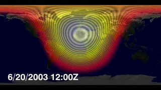
Go to this pageThe Earth's climate is determined by energy transfer from the sun to the Earth's land, oceans, and atmosphere. As the Earth moves around the sun, the fact that the Earth's axis is tilted means that the sun's overhead position moves from the Northern Hemisphere to the Southern Hemisphere and back from one summer to the next. This effect causes winters to be cold and summers warm in the Northern Hemisphere and the opposite in the Southern Hemisphere. This animation shows the incoming solar irradiance on the Earth at noon on the Greenwich meridian during an entire year, illustrating this movement. The magnitude of this irradiance comes from measurements by the TIM instrument on SORCE. Since the Earth's orbit is elliptical, the magnitude of the solar irradiance at the Earth is least when the Earth is farthest from the sun and greatest when the earth is closest. This 6 or 7 percent change can be seen in the animation by watching the dark bands move. When the bands expand from the bright spot, the Earth is getting closer to the sun, from July through December, and when they contract the Earth is moving away, from January through June. The sun's irradiance is also variable from day to day, but that effect is about ten times smaller than the effect of the earth's orbit. ||
Striking a Solar Balance
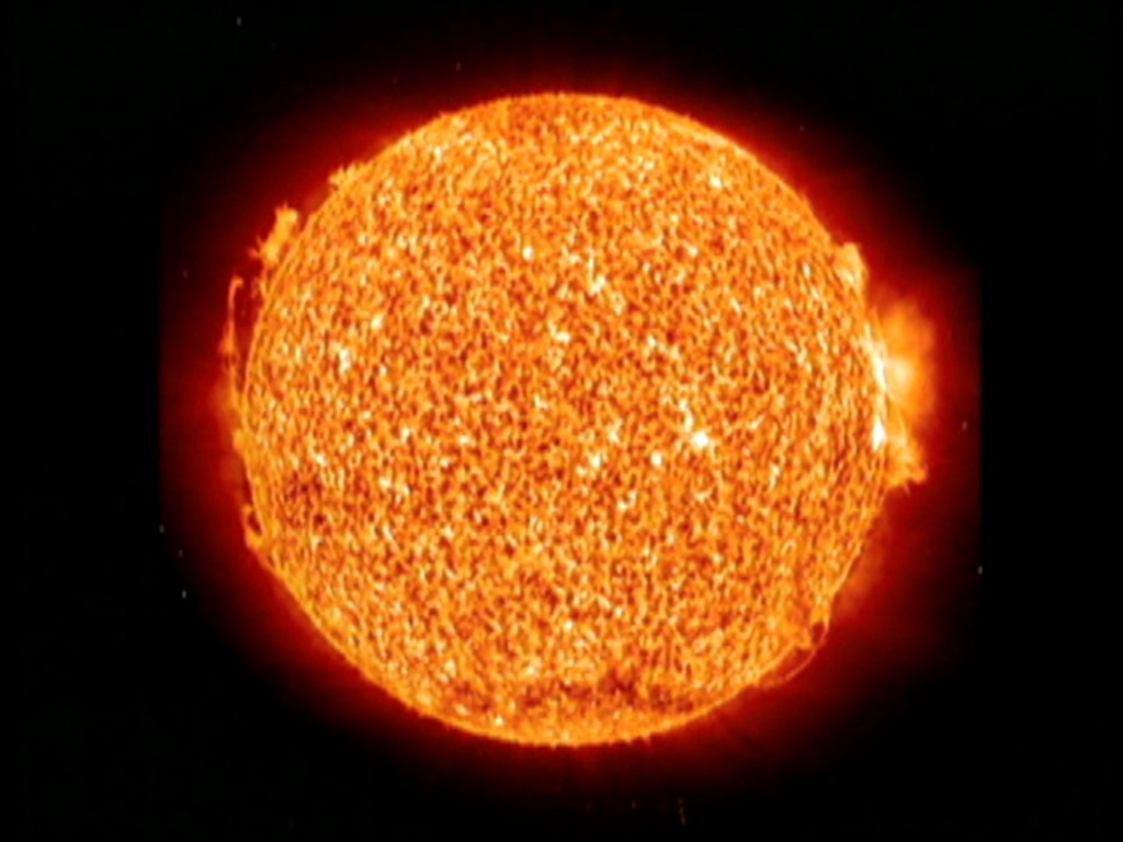
Go to this pageThis short film explores the vital connection between the Earth and the Sun. NASA's Glory mission and the Total Irradiance Monitor will continue nearly three decades of solar irradiance measurments. This crucial data will contribute to the long-term climate record.For complete transcript, click here. || Striking_a_Solar_Balance_640x48001227_print.jpg (1024x768) [110.2 KB] || Striking_a_Solar_Balance_640x480_web.png (320x240) [213.2 KB] || Striking_a_Solar_Balance_640x480_thm.png (80x40) [13.1 KB] || Striking_a_Solar_Balance_640x480_searchweb.png (320x180) [84.5 KB] || Striking_a_Solar_Balance_720x486_ProRes.webmhd.webm (960x540) [44.9 MB] || Striking_a_Solar_Balance_640x480.mpg (640x480) [118.9 MB] || Striking_a_Solar_Balance_720x486_ProRes.mov (720x486) [972.5 MB] || Striking_a_Solar_Balance_640x480_H264.mov (720x486) [171.0 MB] || Striking_a_Solar_Balance_640x480.m4v (640x480) [39.9 MB] || Striking_a_Solar_Balance_320x240.mp4 (320x240) [17.5 MB] || Striking_a_Solar_Balance.wmv (346x260) [30.4 MB] ||
Energy Harnessed by Humans
In our endless quest for new energy resources, people develop new technologies to harness the power of the Sun, the wind, tides, ocean heat, and fossil fuels. These images and visualizations show us some of the many ways humans are tapping into energy resources on Earth.
Science For a Hungry World: Introduction
Go to this pageAs the first of six episodes, Science for a Hungry World: Part 1 sets the groundwork for explaining why NASA data is critical to ensure a stable global food system. This video reveals how satellite remote sensing data provide the world with essential information like the Normalized Difference Vegetation Index, or NDVI, which allows scientists and governments to see the health of crops on a global scale. This video reinforces the idea that a unique perspective from space is essential for continuous global agricultural monitoring and accurate forecasting.For complete transcript, click here. || Science_for_a_Hungry_World_Part_1_320x240.01627_print.jpg (1024x576) [111.9 KB] || Science_for_a_Hungry_World_Part_1_320x240_thm.png (80x40) [17.4 KB] || Science_for_a_Hungry_World_Part_1_320x240_web.png (180x320) [152.7 KB] || Science_for_a_Hungry_World_Part_1_AppleTV.webmhd.webm (960x540) [68.9 MB] || Science_for_a_Hungry_World_Part_1_AppleTV.m4v (960x540) [174.3 MB] || Science_for_a_Hungry_World_Part_1_H264_1280x720.mov (1280x720) [194.6 MB] || Science_for_a_Hungry_World_Part_1_640x480_ipod.m4v (640x360) [57.4 MB] || Science_for_a_Hungry_World_Part_1_for_Rob.m4v (640x360) [39.4 MB] || Science_for_a_Hungry_World_Part_1_320x240.mp4 (320x180) [22.5 MB] || Science_for_a_Hungry_World_Part_1.wmv (320x236) [37.8 MB] || bigmovie-science_for_a_hungry_world_1-introduction.hwshow ||
Sea Surface Temperature, Salinity and Density
Go to this pageSea Surface TemperatureThe oceans of the world are heated at the surface by the sun, and this heating is uneven for many reasons. The Earth's axial rotation, revolution about the sun, and tilt all play a role, as do the wind-driven ocean surface currents. The first animation in this group shows the long-term average sea surface temperature, with red and yellow depicting warmer waters and blue depicting colder waters. The most obvious feature of this temperature map is the variation of the temperature by latitude, from the warm region along the equator to the cold regions near the poles. Another visible feature is the cooler regions just off the western coasts of North America, South America, and Africa. On these coasts, winds blow from land to ocean and push the warm water away from the coast, allowing cooler water to rise up from deeper in the ocean. ||
MERRA Wind
Go to this pageRetrospective-analyses (or reanalyses) have been a critical tool in studying weather and climate variability for the last 15 years. Reanalyses blend the continuity and breadth of output data of a numerical model with the constraint of vast quantities of observational data. The result is a long-term continuous data record. The Modern Era Retrospective-analysis for Research and Applications was developed to support NASA's Earth science objectives, by applying the state-of-the-art GMAO data assimilation system that includes many modern observing systems (such as EOS) in a climate framework.The MERRA time period covers the modern era of remotely sensed data, from 1979 through the present, and the special focus of the atmospheric assimilation is the hydrological cycle.The time period covered by the visualization is the months of May, June, and July of 1988 and 1993, two years with contrasting extreme weather events during the summer: a drought through the midwestern states of the US in 1988, and heavy rains and flooding through the same region in 1993.This visualization shows the combined U and V components of wind at three different pressure levels: 850 mb, 500 mb, and 300 mb. The pressure coordinate is greatly exaggerated.This animation was created as part of a presentation for the Nasa Center for Climate Simulation (NCCS) hyperwall display. This is a set of tiled high definition displays consisting of 5 displays across by 3 displays down. The full resolution of all combined displays is 6840 pixels accross by 2304 pixels down. For the full presentation, see the link below. ||
The Fossil Fuel/Climate Change Connection
When we burn fossil fuels, we release greenhouse gases that warm our planet. Less well understood is how significant those changes will be, and scientists use NASA data to study how climate change will alter oceans, atmosphere, land, and life, including human life. This section explores the connection between fossil fuel energy use and our changing climate.
Greenhouse Gases Effect on Global Warming
Go to this pageThe 'greenhouse effect' is the warming of climate that results when the atmosphere traps heat radiating from Earth toward space. Certain gases in the atmosphere resemble glass in a greenhouse, allowing sunlight to pass into the 'greenhouse,' but blocking Earth's heat from escaping into space. The gases that contribute to the greenhouse effect include water vapor, carbon dioxide (CO2), methane, nitrous oxides, and chlorofluorocarbons (CFCs).On Earth, human activities are changing the natural greenhouse. Over the last century the burning of fossil fuels like coal and oil has increased the concentration of atmospheric CO2. This happens because the coal or oil burning process combines carbon (C) with oxygen (O2) in the air to make CO2. To a lesser extent, the clearing of land for agriculture, industry, and other human activities have increased the concentrations of other greenhouse gases like methane (CH4), and further increased (CO2).The consequences of changing the natural atmospheric greenhouse are difficult to predict, but certain effects seem likely: - On average, Earth will become warmer. Some regions may welcome warmer temperatures, but others may not. - Warmer conditions will probably lead to more evaporation and precipitation overall, but individual regions will vary, some becoming wetter and others dryer. - A stronger greenhouse effect will probably warm the oceans and partially melt glaciers and other ice, increasing sea level. Ocean water also will expand if it warms, contributing to further sea level rise. - Meanwhile, some crops and other plants may respond favorably to increased atmospheric CO2, growing more vigorously and using water more efficiently. At the same time, higher temperatures and shifting climate patterns may change the areas where crops grow best and affect the makeup of natural plant communities. ||
Five-Year Average Global Temperature Anomalies from 1880 to 2010
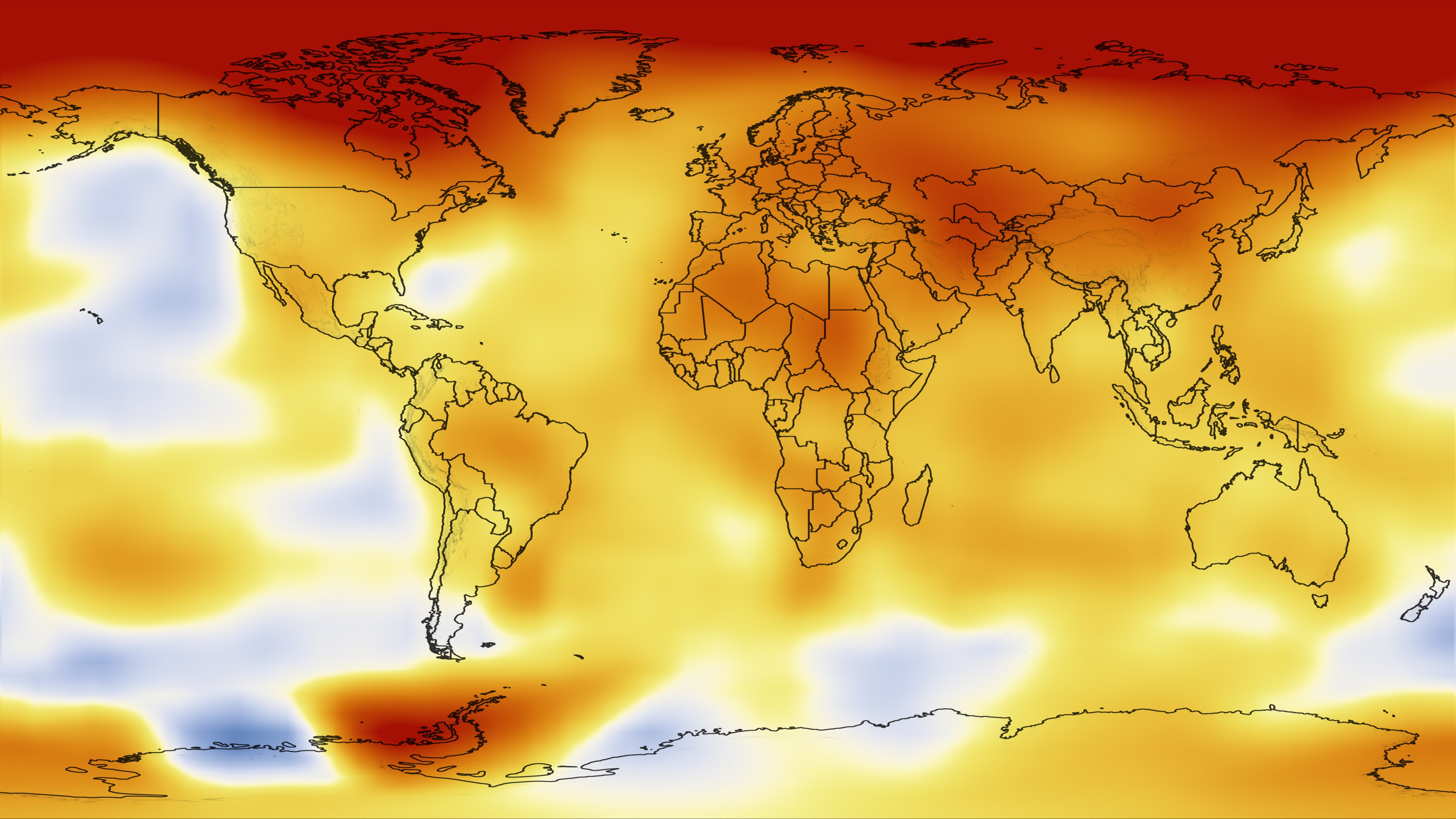
Go to this pageGroups of scientists from several major institutions - NASA's Goddard Institute for Space Studies (GISS), NOAA's National Climatic Data Center (NCDC), the Japanese Meteorological Agency and the Met Office Hadley Centre in the United Kingdom - tally data collected by temperature monitoring stations spread around the world and make an announcement about whether the previous year was a comparatively warm or cool year. This analysis concerns only temperature anomalies, not absolute temperature. Temperature anomalies are computed relative to the base period 1951-1980. The reason to work with anomalies, rather than absolute temperature is that absolute temperature varies markedly in short distances, while monthly or annual temperature anomalies are representative of a much larger region. Indeed, we have shown (Hansen and Lebedeff, 1987) that temperature anomalies are strongly correlated out to distances of the order of 1000 km. For more information about this dataset, see http://data.giss.nasa.gov/gistemp NASA's announcement this year - that 2010 ties 2005 as the warmest year in the 131-year instrumental record - made headlines. But, how much does the ranking of a single year matter?Not all that much, emphasizes James Hansen, the director of NASA's Goddard Institute for Space Studies (GISS) in New York City. In the GISS analysis, for example, 2010 differed from 2005 by less than 0.01°C (0.018°F), a difference so small that the temperatures of these two years are indistinguishable, given the uncertainty of the calculation.Meanwhile, the third warmest year - 2009 - is so close to 1998, 2002, 2003, 2006, and 2007, with the maximum difference between the years being a mere 0.03°C, that all six years are virtually tied.Even for a near record-breaking year like 2010 the broader context is more important than a single year. "Certainly, it is interesting that 2010 was so warm despite the presence of a La Niña and a remarkably inactive sun, two factors that have a cooling influence on the planet, but far more important than any particular year's ranking are the decadal trends," Hansen said. ||
Piecing Together the Temperature Puzzle
Go to this pageThe decade from 2000 to 2009 was the warmest in the modern record. "Piecing Together the Temperature Puzzle" illustrates how NASA satellites enable us to study possible causes of climate change. The video explains what role fluctuations in the solar cycle, changes in snow and cloud cover, and rising levels of heat-trapping gases may play in contributing to climate change. For complete transcript, click here. || Temperature_Puzzle_fullres.01252_print.jpg (1024x576) [113.2 KB] || Temperature_Puzzle_fullres_web.png (320x180) [207.8 KB] || Temperature_Puzzle_fullres_thm.png (80x40) [16.9 KB] || Temperature_Puzzle_AppleTV.webmhd.webm (960x540) [83.9 MB] || Temperature_Puzzle_fullres.mov (1280x720) [166.2 MB] || Temperature_Puzzle_AppleTV.m4v (960x720) [211.4 MB] || Temperature_Puzzle__Youtube.mov (1280x720) [87.7 MB] || Temperature_Puzzle_iPod_small.m4v (640x360) [67.9 MB] || Temperature_Puzzle_iPod_large.m4v (320x180) [27.9 MB] || Temperature_Puzzle_svs.mpg (512x288) [136.6 MB] || Temperature_Puzzle_portal.wmv (346x260) [38.8 MB] ||
Aqua/AIRS Global Carbon Dioxide
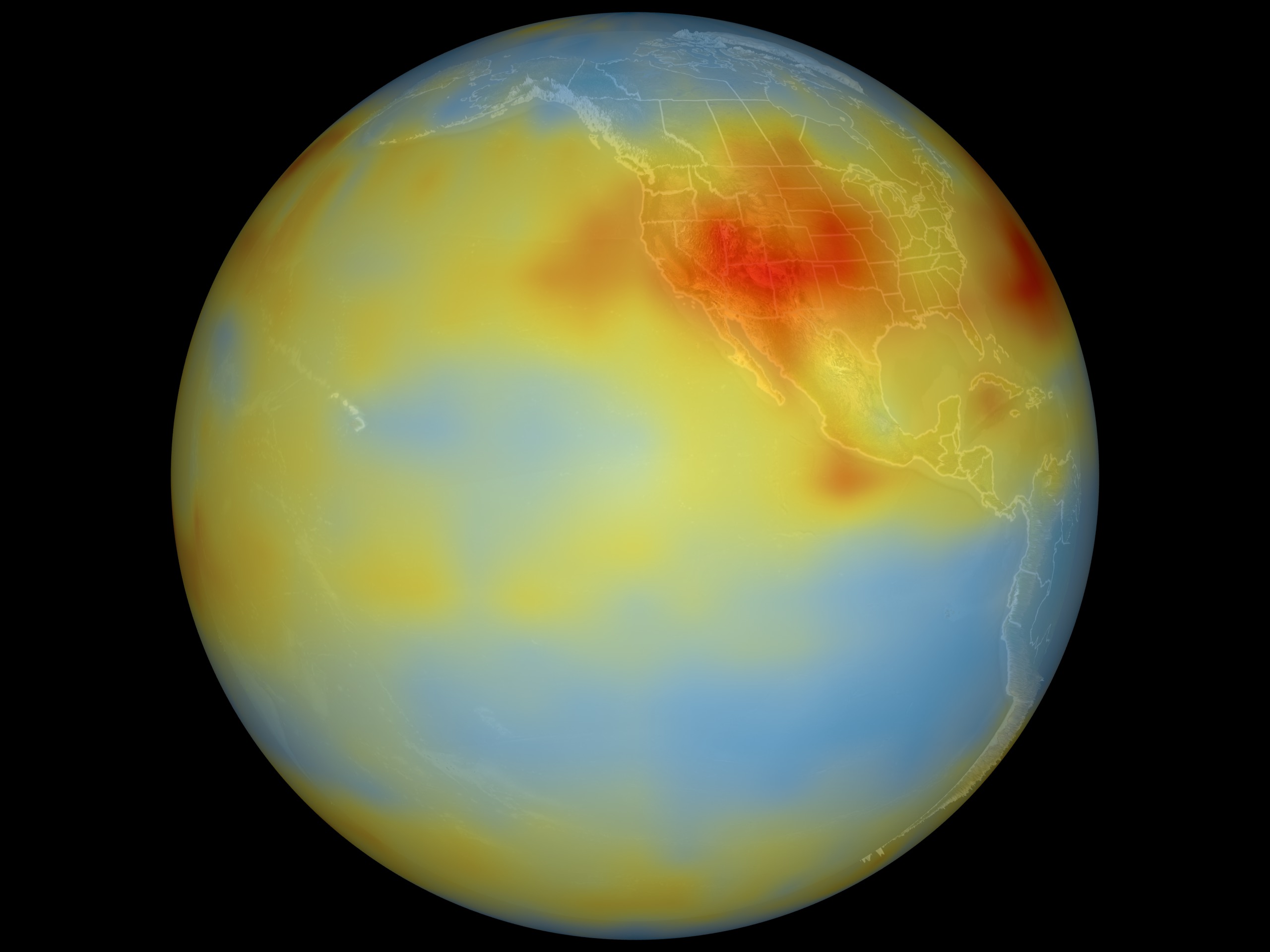
Go to this pageAlthough originally designed to measure atmospheric water vapor and temperature profiles for weather forecasting, data from the Atmospheric Infrared Sounder (AIRS) instrument on NASA's Aqua spacecraft are now also being used by scientists to observe atmospheric carbon dioxide. Scientists from NASA; the National Oceanic and Atmospheric Administration; the European Center for Medium-Range Weather Forecasts; the University of Maryland, Baltimore County; Princeton University, Princeton, New Jersey; and the California Institute of Technology (Caltech), Pasadena, Calif., are using several different methods to measure the concentration of carbon dioxide in the mid-troposphere (about eight kilometers, or five miles, above the surface). This visualization shows Aqua/AIRS mid-tropospheric carbon dioxide from July 2003. Low concentrations, 360 ppm, are shown in blue and high concentrations, 385 ppm, are shown in red. Notice that despite carbon dioxide's high degree of mixing, the regional patterns of atmospheric sources and sinks are still apparent in mid-troposphere carbon dioxide concentrations. This pattern of high carbon dioxide in the Northern Hemisphere (North America, Atlantic Ocean, and Central Asia) is consistent with model predictions.For more information on AIRS, visit the AIRS Project Web Site: http://airs.jpl.nasa.gov. The AIRS data products are available at http://daac.gsfc.nasa.gov/AIRS/index.shtml. ||
AMSR-E Arctic Sea Ice: September 2009 to March 2010
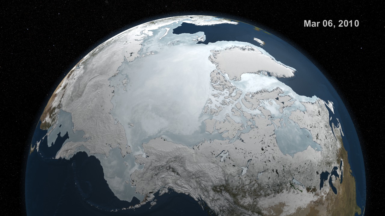
Go to this pageSea ice is frozen seawater floating on the surface of the ocean. Some sea ice is semi-permanent, persisting from year to year, and some is seasonal, melting and refreezing from season to season. The sea ice cover reaches its minimum extent at the end of each summer and the remaining ice is called the perennial ice cover.In this animation, the Arctic sea ice and seasonal land cover change progress through time, from September 1, 2009 when sea ice in the Arctic was near its minimum extent, through March 30, 2010. The animation plays at a rate of six frames per day or ten days per second. Over the water, Arctic sea ice changes from day to day showing a running 3-day maximum sea ice concentration in the region where the concentration is greater than 15%. The blueish white color of the sea ice is derived from a 3-day running maximum of the AMSR-E 89 GHz brightness temperature. Over the terrain, monthly data from the seasonal Blue Marble Next Generation fades slowly from month to month. ||
Exploring Ozone
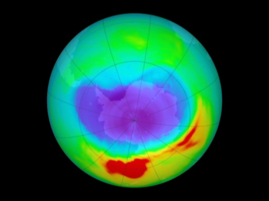
Go to this pageThis short video combines dynamic ozone visualizations with an interview with leading atmospheric NASA scientist, Dr. Paul Newman. Dr. Newman explains why ozone is important, he cites the ingredients that cause an ozone hole to form, and he remarks on the future of the ozone, pointing to exciting new areas of ozone research, including the role climate change will play in future years. ||
Who Consumes More Energy?
NASA gathers and analyzes data about resource consumption by constantly monitoring the chemical and other by-products of agriculture, industry, and transportation. Satellites such as Aqua, Aura, and Terra take measurements from fires, carbon dioxide, carbon monoxide, and other pollutants, and scientists can map the output on the globe.
Earth At Night (WMS)
Go to this pageThis image of Earth's city lights was created with data from the Defense Meteorological Satellite Program (DMSP) Operational Linescan System (OLS). Originally designed to view clouds by moonlight, the OLS is also used to map the locations of permanent lights on the Earth's surface.The brightest areas of the Earth are the most urbanized, but not necessarily the most populated. (Compare western Europe with China and India.) Cities tend to grow along coastlines and transportation networks. Even without the underlying map, the outlines of many continents would still be visible. The United States interstate highway system appears as a lattice connecting the brighter dots of city centers. In Russia, the Trans-Siberian railroad is a thin line stretching from Moscow through the center of Asia to Vladivostok. The Nile River, from the Aswan Dam to the Mediterranean Sea, is another bright thread through an otherwise dark region.Even more than 100 years after the invention of the electric light, some regions remain thinly populated and unlit. Antarctica is entirely dark. The interior jungles of Africa and South America are mostly dark, but lights are beginning to appear there. Deserts in Africa, Arabia, Australia, Mongolia, and the United States are poorly lit as well (except along the coast), along with the boreal forests of Canada and Russia, and the great mountains of the Himalaya. ||
Global Transport of Black Carbon
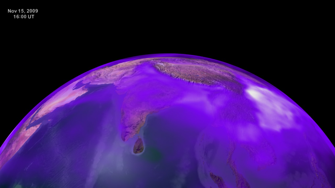
Go to this pageTiny air pollution particles commonly called soot, but also known as black carbon, are in the air and on the move throughout our planet. Black carbon enters the air when fossil fuels and biofuels, such as coal, wood, and diesel are burned. Since black carbon readily absorbs heat from sunlight, the particles can affect Earth's climate, especially on a regional scale. Though global distribution of soot remains difficult to measure, NASA researchers use satellite data and computer models to better understand how these short-lived particles influence Earth's climate, cryosphere, and clouds. This scientific data visualization uses data from the GEOS5 GOCART climate model to show black carbon's atmospheric concentration from August to November in 2009.A flat map version of this animation is available.This visualziation was created in support of a presentation at the Fall 2009 American Geophysical Union (AGU) conference in San Fransisco, CA. ||
Ship Tracks Reveal Pollution's Effects on Clouds
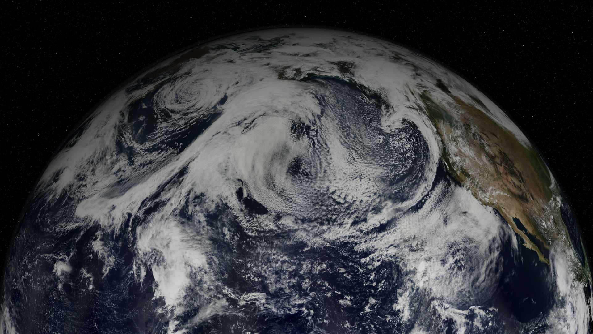
Go to this pageNASA's MODIS satellite instrument is revealing that humans may be changing our planet's brightness. Pollution in the atmosphere creates smaller, brighter cloud droplets that reflect more sunlight back to space and may have a slight impact on global warming.This narrated visualization illustrates how we can study the effect against a clean backdrop by looking for zones of pollution in otherwise pristine air - in this case the North Pacific Ocean near the Aleutian islands. On an overcast day, the clouds look uniform. However, MODIS' sesor reveals a different picture - long skinny trails of brighter clouds hidden within. As ships travel across the ocean, pollution in the ships' exhaust create more cloud drops that are smaller in size, resulting in even brighter clouds. On clear days, ships can actually create new clouds. Water vapor condenses around the particles of pollution, forming streamers of clouds as the ships travel on. The ship tracks themselves are too small to impact global temperatures, but they help us understand how larger pollution sources such as industrial sites or agricultural burning might be changing clouds on a larger scale. ||
Three Months of Oil: Satellites View Gulf Oil Spill
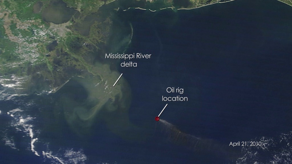
Go to this pageOn April 20, 2010, the Deepwater Horizon oil rig exploded in the Gulf of Mexico, triggering the largest oil spill in U.S. history. The MODIS instrument, on board NASA's Terra and Aqua satellites, continues to capture imagery of the region. This short video time series shows a satellite perspective of the spill through July 12, 2010, and updates the earlier NASA video time series released on May 27, 2010. The oil slick appears a dull grayish-beige in the images and changes due in part to to changing weather, ocean currents, and the use of oil dispersing chemicals. The oil slick only appears clearly in MODIS imagery when the sun is a a particular angle in relation to the satellite's position as it orbits over the Gulf. In areas where sunlight reflects off the ocean's surface toward the satellite, oil-slicked water usually looks brighter than cleaner ocean water in the region.Images in the video time series were selected that show the spill most clearly. The full image archive is available on the MODIS Rapid Response web site. ||
Fire Observations - As the World Turns
Go to this pageFrom space, we can understand fires in ways that are impossible from the ground. NASA research has contributed to much improved detection of fire for scientific purposes using satellite remote sensing and geographic information systems. This has helped advance our understanding of the impacts of fire in many areas of earth science, including atmospheric chemistry and the impacts on protected areas. This research has led to the development of a rapid response system widely used throughout the world for both natural resource management and for firefighting by providing near real-time information. In this animation of fires around the globe in 2007, each red dot marks a new fire. From brush fires in Africa to forest fires in North America, satellites are locating every significant fire on Earth to within one kilometer. More information on the Fire Information for Resource Management (FIRMS) is available at http://maps.geog.umd.edu/firms/ ||
MODIS Data May Aid EPA Air Quality Predictions (Tight)
Go to this pageThis visualization shows how MODIS data from NASA's Terra and Aqua spacecraft may be able to help EPA in producing air quality index forecasts.Currently, most air quality forecasts are generated from ground based measuring stations; however, these stations generally only exist in heavily populated areas. MODIS data may help EPA provide air quality forcasts over much wider areas and with higher accuracy. In this visualization, the EPA air quality data shows as the thin colored boxes sticking out from the surface. The MODIS data is represented by the colored overlay. An event that began over the northwestern US in September 2003 is shown propagating across the US and into the Midwest. Notice that the movement of the air mass is evident only from the MODIS data.This version of the animation shows a narrow view of the US. This animation was inspired by a similar animation created at the Langley Research Center. ||


