Welcome to
Visualizing Earth Systems: A NASA Quick Start Guide for Educators

At the core of scientific visualization is the representation of data graphically - through images, animations, and videos - to improve understanding and develop insight. Visualizations allow us to explore data, phenomena and behavior; they are particularly effective for showing large scales of time and space, and "invisible" processes (e.g. flows of energy and matter) as integral parts of the models.

This page features visualizations from the NASA Scientific Visualization Studio (SVS). Each provides a unique perspective of the complexity and interconnectedness of Earth's systems. Some of the visualizations, marked annotated, include narration- making them ideal for introducing students to complex Earth science topics. Others, marked non-annotated, contain no narration or labels. They are designed to encourage student questioning and conversation - the first steps to inquiry-based learning.

K-12 Lessons: Links are provided to related learning resources for elementary, middle and high school. These are from NASA Wavelength, a reviewed collection of standards-based resources for Earth and space science education. You can find additional resources related to visualizing Earth systems here.

Video Interview (2015): Join NASA visualizer Kel Elkins in NASA's Scientific Visualization Studio as he shares insights into the creation of three of the visualizations listed below. In addition, Kel answers questions about his work, education and career.

Visualizations

Cause and Effect

Identifying cause and effect relationships can help us make predictions about the function of natural systems and their impact on the world. These relationships, whether simple or complex, are vital for forecasting weather and predicting Earth events in new contexts.

Aquarius Sea Surface Salinity (2011-2014) Non-Annotated Visualizations

Salinity is key to studying the water cycle and ocean circulation, both of which are related to climate. Over decades, the amount of salt in ocean basins has been fairly stable. The water cycle operates on much faster time scales, however, causing changes in salinity patterns.

Changes in sea surface salinity (concentration of dissolved salt), provide a fingerprint of Earth's freshwater cycle. Salinity decreases when freshwater enters the ocean from rivers, melting ice, rain and snow. Processes that cause freshwater to exit the ocean such as evaporation and formation of sea ice raise salinity. Differences in dissolved salt content also play a major role in moving seawater, and the heat it carries, around the globe.

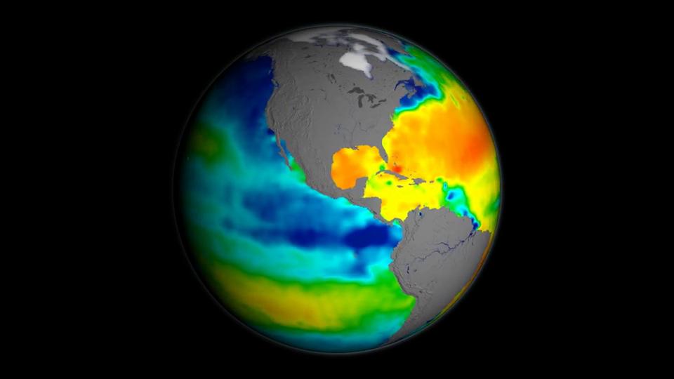
This visualization shows sea surface salinity observations (September 2011-September 2014) from the Aquarius/SAC-D mission, a collaboration between NASA and the Space Agency of Argentina. The data is shown on a spinning globe.

Higher salinity areas are shown in red. These regions of high evaporation are sometimes called "ocean deserts." Blue colors represent lower salinities, resulting from freshwater inputs into the ocean. These include Amazon River outflow that appears as a ribbon-like feature in the tropical Atlantic, a zone of persistent rainfall that spans the tropical Pacific, and melting ice near Earth's poles.

For the particular month shown in the still images (October 2012), several well-known ocean salinity features are shown, such as higher salinity in the subtropics; higher average salinity in the Atlantic Ocean compared to the Pacific and Indian oceans; and lower salinity in rainy belts near the equator, in the northernmost Pacific Ocean and elsewhere. These features are related to large-scale patterns of rainfall and evaporation over the ocean, river outflow and ocean circulation.

View the Video Interview (2015) with visualizer Kel Elkins for a guided walk through of this visualization, starting at 1:25.

Credit: NASA Scientific Visualization Studio

Read More...

Driving Ocean (2012) Annotated Visualizations

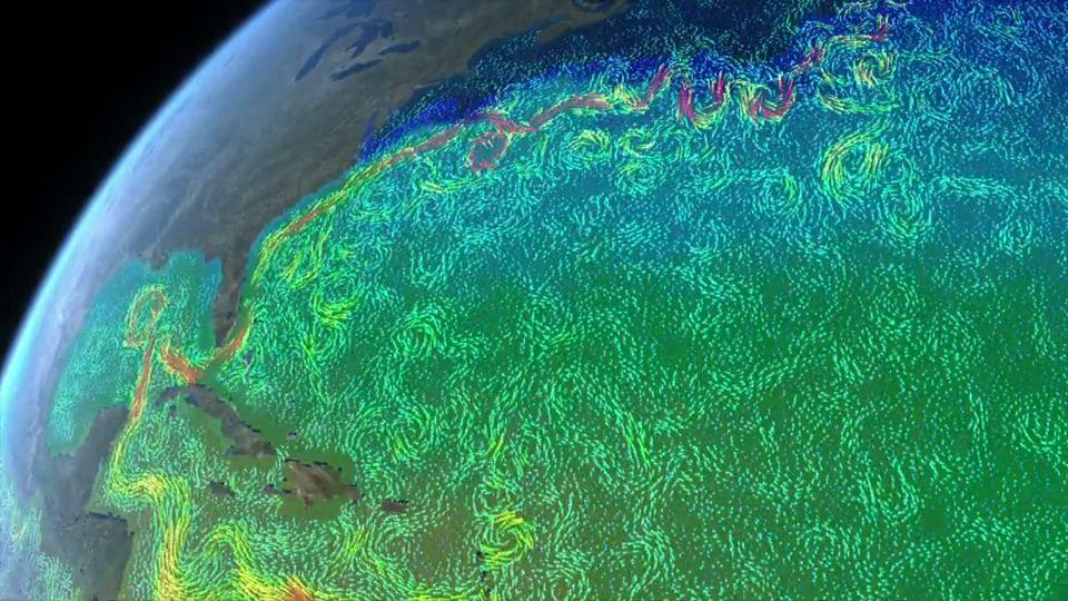
The ocean is essential to life on Earth. Most of Earth's water is stored in the ocean. Much of Earth's population lives near the coast, but the ocean impacts everyone, no matter where they live. This animation conveys both the causes and the effects of Earth's oceanic processes. It uses Earth science data from a variety of sensors on NASA Earth observing satellites to measure physical oceanography parameters such as ocean currents, ocean winds, sea surface height and sea surface temperature. These measurements, in combination with atmospheric measurements such as air temperature, precipitation and clouds, can help scientists understand the ocean's impact on weather and climate and the subsequent impacts on life here on Earth. NASA satellites and their unique view from space are helping to unveil the vast and ever-changing ocean.

Credit: NASA

Falling Sky (2014) Non-Annotated Visualizations

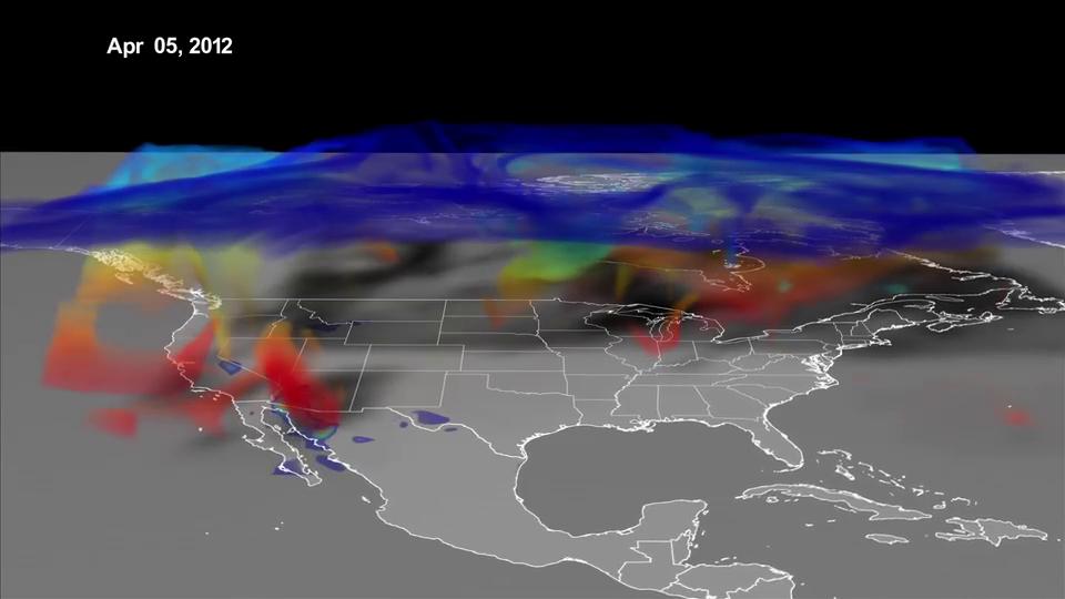
Ozone, a chemical made up of three oxygen atoms, naturally forms in the stratosphere creating a protective layer around the planet that helps shield Earth from the sun's harmful ultraviolet rays. But near the surface, where we live and breathe, that same chemical is a pollutant that can cause respiratory distress. Sometimes air from the upper atmosphere descends to lower altitudes, transporting ozone with it. Such events, known as stratospheric ozone intrusions, may lead to unexpected spikes in ozone pollution levels. The mysterious events often take place over elevated terrain in mountainous states like Colorado, Nevada and California. In April 2012, curtains of ozone plunged from the upper atmosphere and covered parts of the western United States. Using a high-resolution model, NASA scientists simulated the event, showing where high concentrations of ozone made contact with the ground. Watch the video to see the event unfold.

Credit: NASA Scientific Visualization Studio

Secret Life of Forests (1984-2011) Annotated Visualizations

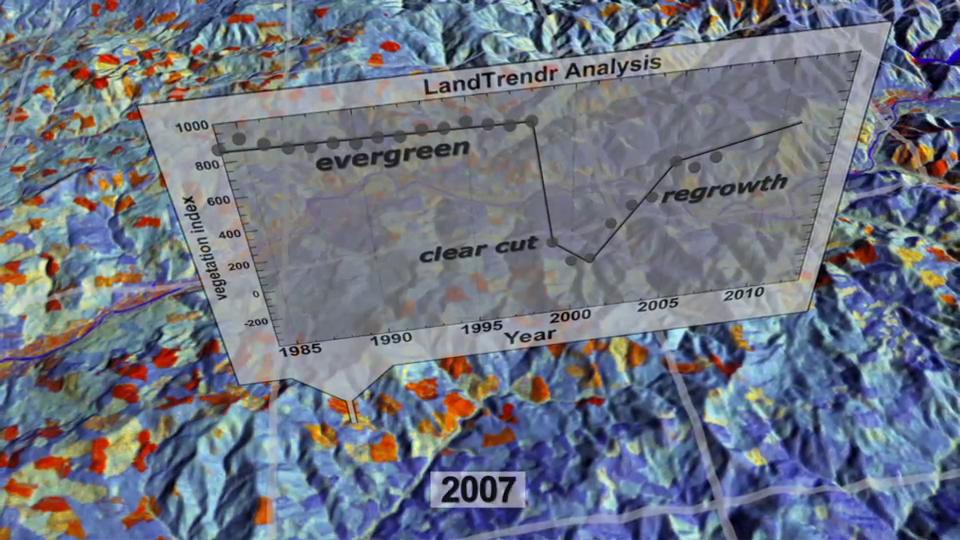
Forests are constantly changing. The Landsat satellite program, operated jointly by NASA and the U.S. Geological Survey, has monitored those changes from space for over four decades. Scientists are turning yearly Landsat data sets into powerful time series that show the evolution of the landscape. This visualization of the Pacific Northwest from 1984 to 2011 reveals many cause and effect relationships. Some are obvious, like the patchwork of logged land that flickers from mature trees (blue) to clear-cut (red) to regrown shrubs (yellow). Some are subtle, like the bark beetle or western spruce budworm infestations (dark red) that pulse across mountainsides. Watch as these and other changes come to life in the video.

Credit: NASA Scientific Visualization Studio

Energy and Matter

Follow a Saharan dust plume across the Atlantic, or track water on its global journey via the hydrological cycle to 'see' the role that energy plays in cycling matter within the Earth system. Energy powers the transformation and movement of matter in all Earth system processes.

Aquarius Sea Surface Salinity (2011-2014) Non-Annotated Visualizations

Salinity is key to studying the water cycle and ocean circulation, both of which are related to climate. Over decades, the amount of salt in ocean basins has been fairly stable. The water cycle operates on much faster time scales, however, causing changes in salinity patterns.

Changes in sea surface salinity (concentration of dissolved salt), provide a fingerprint of Earth's freshwater cycle. Salinity decreases when freshwater enters the ocean from rivers, melting ice, rain and snow. Processes that cause freshwater to exit the ocean such as evaporation and formation of sea ice raise salinity. Differences in dissolved salt content also play a major role in moving seawater, and the heat it carries, around the globe.

This visualization shows sea surface salinity observations (September 2011-September 2014) from the Aquarius/SAC-D mission, a collaboration between NASA and the Space Agency of Argentina. The data is shown on a spinning globe.

Higher salinity areas are shown in red. These regions of high evaporation are sometimes called "ocean deserts." Blue colors represent lower salinities, resulting from freshwater inputs into the ocean. These include Amazon River outflow that appears as a ribbon-like feature in the tropical Atlantic, a zone of persistent rainfall that spans the tropical Pacific, and melting ice near Earth's poles.

For the particular month shown in the still images (October 2012), several well-known ocean salinity features are shown, such as higher salinity in the subtropics; higher average salinity in the Atlantic Ocean compared to the Pacific and Indian oceans; and lower salinity in rainy belts near the equator, in the northernmost Pacific Ocean and elsewhere. These features are related to large-scale patterns of rainfall and evaporation over the ocean, river outflow and ocean circulation.

View the Video Interview (2015) with visualizer Kel Elkins for a guided walk through of this visualization, starting at 1:25.

Credit: NASA Scientific Visualization Studio

Read More...

Dust Crossing (2015) Narrated Visualizations

The Sahara Desert is a near-uninterrupted brown band of sand and scrub across the northern third of Africa. The Amazon rain forest is a dense green mass of humid jungle that covers northeast South America. These two very different ecosystems are connected across the Atlantic Ocean by atmospheric circulation. After strong winds sweep across the Sahara, a cloud of dust rises in the air and stretches between the continents. When the dust settles in the Amazon, it deposits phosphorus, an essential nutrient that acts like a fertilizer. NASA's CALIPSO satellite has quantified in three dimensions how much dust makes this trans-Atlantic journey. The study is part of a bigger research effort to understand the role of dust and aerosols in the environment.

Watch the Video Interview (2015) with visualizer Kel Elkins for a guided walk through of this visualization, starting at 0:54.

Students can explore these data using MY NASA DATA (http://mynasadata.larc.nasa.gov) - a resource designed for K-12 education. Following is a link to CALIPSO dust in MY NASA DATA.

Credit: NASA Scientific Visualization Studio and Goddard Space Flight Center

Read More...

North Atlantic Chlorophyll (1997-2006) Non-Annotated Visualizations

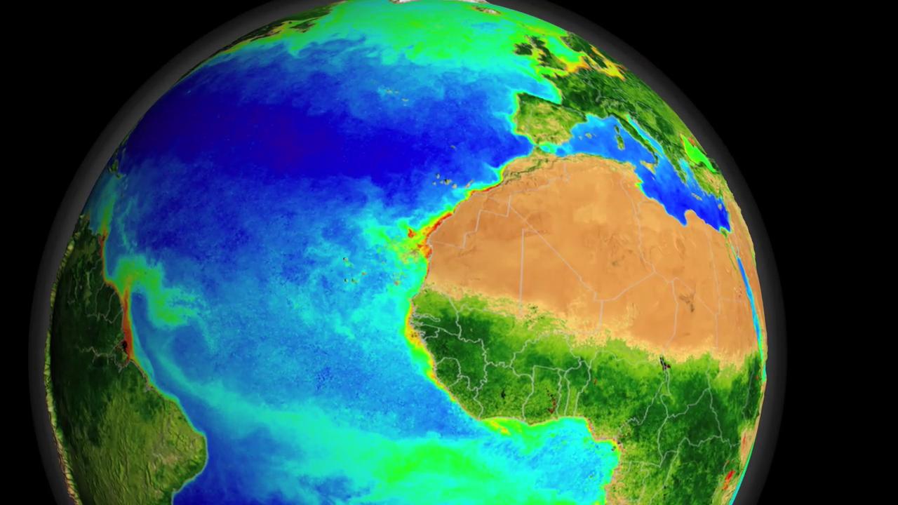
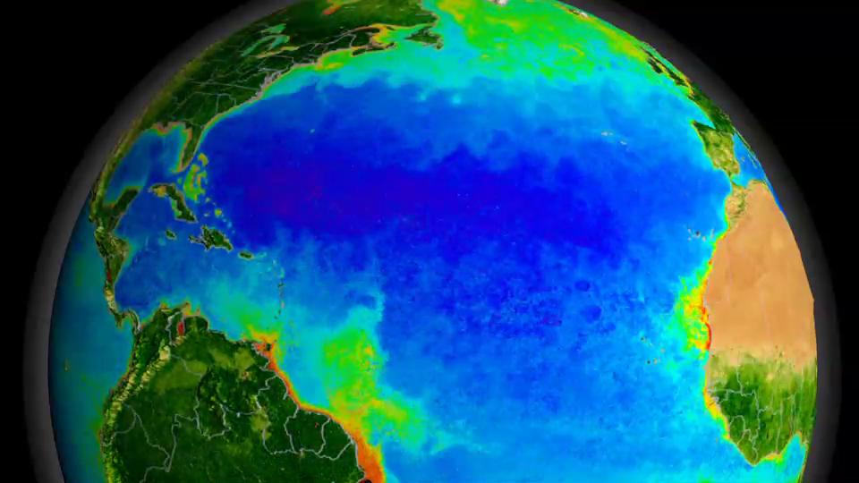
The Sea-Viewing Wide Field-of-View Sensor (SeaWiFS) instrument aboard the Seastar satellite collected ocean data for more than a decade. By monitoring the color of reflected light via satellite, scientists can determine chlorophyll concentrations, indicating how successfully plant life is photosynthesizing. Ocean chlorophyll concentration is essentially a measurement of the successful growth of microscopic plants, called phytoplankton. Dark blue represents areas where phytoplankton are scarce often due to lack of nutrients. Greens and reds, on the other hand, indicate an abundance of phytoplankton, which often correlates with nutrient-rich areas. These can include coastal regions where cold water rises from the seafloor and near the mouths of rivers.

Credit: NASA Scientific Visualization Studio, The SeaWiFS Project and GeoEye. NOTE: All SeaWiFS images and data are for research and educational use only. All commercial use of SeaWiFS data must be coordinated with GeoEye (http://www.geoeye.com). Data provided by: Norman Kuring (NASA/GSFC)

Longwave Radiation (2012) Non-Annotated Visualizations

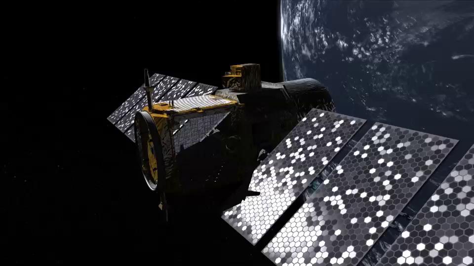
CERES (Clouds and the Earth's Radiant Energy System) is one of the highest priority scientific satellite instruments developed for NASA's Earth Observing System (EOS).

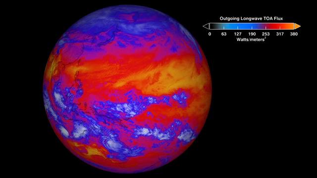
This global view shows CERES top-of-atmosphere (TOA) longwave radiation from January 26 and 27, 2012. Heat energy radiated from Earth (in Watts per square meter) is shown in shades of yellow, red, blue and white. The brightest-yellow areas are emitting the most energy out to space, while the dark blue and bright white areas (clouds) are much colder, emitting the least energy. Increasing temperature, decreasing water vapor, and decreasing clouds all tend to increase the ability of Earth to shed heat out to space.

The Sun's radiant energy is the fuel that drives Earth's climate engine. The Earth-atmosphere system constantly adjusts to maintain a balance between the energy that reaches the Earth from the Sun and the energy that flows from Earth back out to space. Energy received from the Sun is mostly in the visible (or shortwave) part of the electromagnetic spectrum, where Earth's atmosphere is transparent. About 30% of the solar energy that comes to Earth is reflected back to space by clouds and aerosols or bright surfaces. The ratio of reflected-to-incoming energy is called "albedo" from the Latin word meaning whiteness. The solar radiation absorbed by the Earth causes the planet to heat up until it is radiating (or emitting) as much energy back into space as it absorbs from the Sun. The Earth's thermal emitted radiation is mostly in the infrared (or longwave) part of the spectrum, where Earth's atmosphere is not transparent. Thus, much of the emission to space is from the higher levels of the atmosphere. The balance between incoming and outgoing energy is called the Earth's radiation budget.

CERES products include both solar-reflected and Earth-emitted radiation from the top of the atmosphere to the Earth's surface. Cloud properties are determined using simultaneous measurements by other EOS and NPP instruments such as the Moderate Resolution Imaging Spectroradiometer (MODIS) and the Visible Infrared Imaging Radiometer Suite (VIIRS). Analyses using CERES data build upon the foundation laid by previous missions such as the NASA Earth Radiation Budget Experiment (ERBE), leading to a better understanding of the role of clouds and the energy cycle in global climate change.

For more information on CERES see http://ceres.larc.nasa.gov.

Students can explore these data using MY NASA DATA (http://mynasadata.larc.nasa.gov), a resource designed for K-12 education. Following is a link to CERES longwave radiation for the month shown in the visualization (Note: MY NASA DATA uses a different color key and scale than the CERES visualizations on the DVD and generally provides data on monthly averages so that broader features can be seen).

CERES Longwave Radiation in MY NASA DATA

Credit: NASA Scientific Visualization Studio

Read More...

Shortwave Radiation (2012) Non-Annotated Visualizations

CERES (Clouds and the Earth's Radiant Energy System) is one of the highest priority scientific satellite instruments developed for NASA's Earth Observing System (EOS).

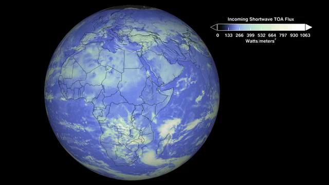
This global view shows CERES top-of-atmosphere (TOA) shortwave radiation from January 26 and 27, 2012. Light energy reflected from Earth (in Watts per square meter) is shown in shades of blue and white. The brightest-white areas (generally clouds) are reflecting the most energy out to spare, while the darker blues areas reflect much less. Increasing cloud cover and snow/ice cover all tend to increase the ability of Earth to reflect energy out to space.

The Sun's radiant energy is the fuel that drives Earth's climate engine. The Earth-atmosphere system constantly adjusts to maintain a balance between the energy that reaches the Earth from the Sun and the energy that flows from Earth back out to space. Energy received from the Sun is mostly in the visible (or shortwave) part of the electromagnetic spectrum, where Earth's atmosphere is transparent. About 30% of the solar energy that comes to Earth is reflected back to space by clouds and aerosols or bright surfaces. The ratio of reflected-to-incoming energy is called "albedo" from the Latin word meaning whiteness. The solar radiation absorbed by the Earth causes the planet to heat up until it is radiating (or emitting) as much energy back into space as it absorbs from the Sun. The Earth's thermal emitted radiation is mostly in the infrared (or longwave) part of the spectrum, where Earth's atmosphere is not transparent. Thus, much of the emission to space is from the higher levels of the atmosphere. The balance between incoming and outgoing energy is called the Earth's radiation budget.

CERES products include both solar-reflected and Earth-emitted radiation from the top of the atmosphere to the Earth's surface. Cloud properties are determined using simultaneous measurements by other EOS and NPP instruments such as the Moderate Resolution Imaging Spectroradiometer (MODIS) and the Visible Infrared Imaging Radiometer Suite (VIIRS). Analyses using CERES data build upon the foundation laid by previous missions such as the NASA Earth Radiation Budget Experiment (ERBE), leading to a better understanding of the role of clouds and the energy cycle in global climate change.

For more information on the Clouds and Earth's Radiant Energy System (CERES) see http://ceres.larc.nasa.gov.

Students can explore these data using MY NASA DATA (http://mynasadata.larc.nasa.gov), a resource designed for K-12 education. Following is a link to CERES shortwave radiation for the month shown in the visualization (Note: MY NASA DATA uses a different color key and scale than the CERES visualizations on the DVD and generally provides data on monthly averages so that broader features can be seen).

CERES Shortwave Radiation in MY NASA DATA

Credit: NASA Scientific Visualization Studio

Read More...

Sea Surface Temperature Non-Annotated Visualizations

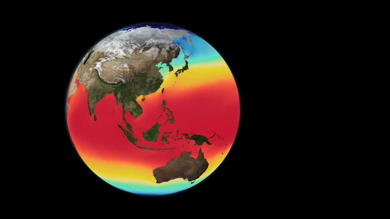
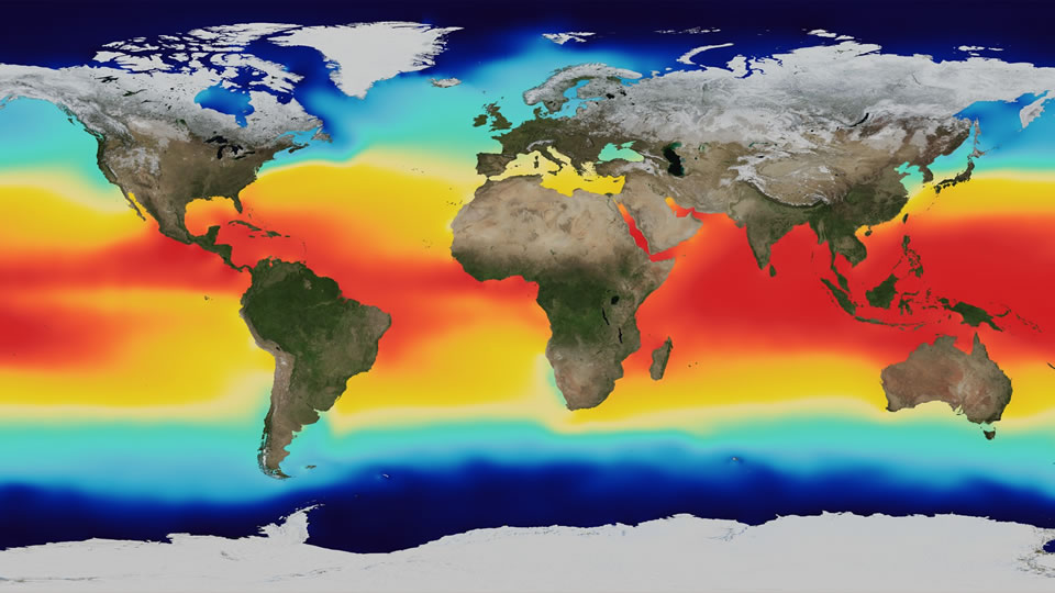
The world's ocean is heated at the surface by the sun, and this heating is uneven for many reasons. Earth's rotation, revolution around the sun, and tilt all play a role, as do the wind-driven ocean surface currents. This animation shows the long-term average sea surface temperature, with red and yellow depicting warmer waters and blue depicting colder waters. The most obvious feature of this temperature map is the variation of the temperature by latitude, from the warm region along the equator to the cold regions near the poles. Another visible feature is the cooler regions just off the western coasts of North America, South America, and Africa. In these regions, the combination of Earth's rotation and alongshore winds push water away from the coast, allowing cooler water to rise from deeper in the ocean. The long-term average (or "climatology") of sea surface temperature used in this animation came from the World Ocean Atlas 2005.

Credit: NASA Scientific Visualization Studio; The Blue Marble Next Generation data is courtesy of Reto Stockli (NASA/Goddard Space Flight Center) and NASA Earth Observatory.

Super Blooms (2003-2006) Non-Annotated Visualizations

Turbulent storms churn the ocean in winter, adding nutrients to sunlit waters near the surface. Each spring this gives rise to massive blooms of phytoplankton. These microscopic plants harvest vital energy from sunlight through photosynthesis. The natural pigments, called chlorophyll, allow phytoplankton to thrive in Earth's oceans and enable scientists to monitor blooms from space. Satellites reveal the location and abundance of phytoplankton by detecting the amount of chlorophyll present in coastal and open waters-the higher the concentration, the larger the bloom. Observations show blooms typically last until late spring or early summer, when nutrients become less available and predatory zooplankton start to graze. The visualization uses NASA SeaWiFS (Sea-Viewing Wide Field-of-View Sensor) data to map blooms in the North Atlantic and North Pacific oceans from March 2003 to October 2006. Dark blue represents areas where there phytoplankton are scarce due to lack of nutrients. Greens and reds, on the other hand, indicate an abundance of phytoplankton, which often correlates with nutrient-rich areas. These can include coastal regions where cold water rises from the sea floor and near the mouths of rivers.

Credit: NASA Scientific Visualization Studio

Water Cycle: Heating the Ocean (2012) Non-Annotated Visualizations

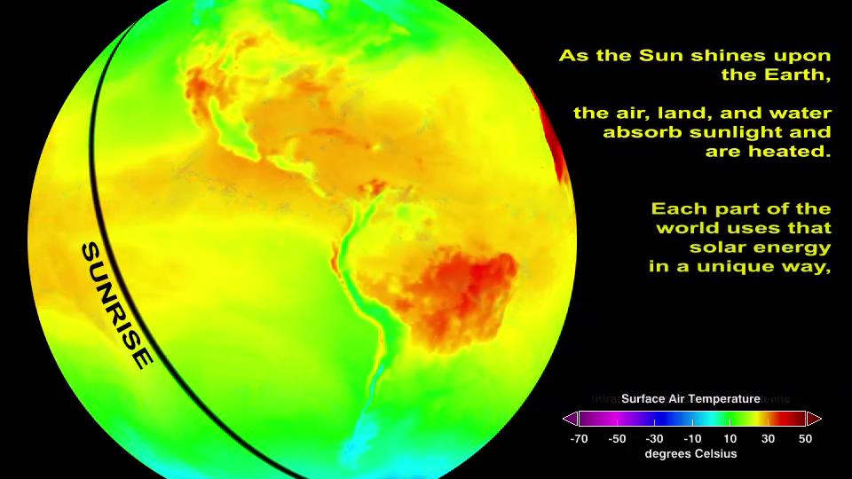
The Earth acts as a giant engine that uses solar power to move air in the atmosphere and water in the ocean. This engine drives the water cycle, which includes the movement of water from the ocean to the atmosphere by evaporation, from the atmosphere to the land by precipitation, and from the land back to the ocean by rivers and streams. The water cycle provides fresh water needed to sustain life. In this visualization series, the cycle begins when the top of the ocean absorbs sunlight. The sun's heat is dispersed in the upper ocean by waves and currents. Water has a high heat capacity and the ocean can absorb a lot of heat without much change in temperature. As a result, the ocean cools off very little at night. Materials forming the land surface such as rocks and soil, however, have lower heat capacity. Thus land temperature changes rapidly, even from night to day. The visualization shows the solar heating of Earth's surface, including the dynamic picture of key stages of water's cyclical journey from sea to air to land, and back again.

This is the first of a four-part series on the water cycle, which follows the journey of water from the ocean to the atmosphere, to the land, and back again to the ocean. The other videos are available online:

The Water Cycle: Following The Water:
http://svs.gsfc.nasa.gov/cgi-bin/details.cgi?aid=10885

The Water Cycle: Steaming The Air:
http://svs.gsfc.nasa.gov/cgi-bin/details.cgi?aid=10883

The Water Cycle: Watering The Land
http://svs.gsfc.nasa.gov/cgi-bin/details.cgi?aid=10884

Credit: NASA Scientific Visualization Studio

Read More...

Patterns, Similarities, and Differences

Explore the spatial patterns observed in meteorological data and learn how this information is used to predict weather and understand climate behavior. By observing patterns in data we can classify our observations and investigate underlying cause and effect relationships.

27 Storms: Arlene to Zeta (2011) Annotated Visualizations

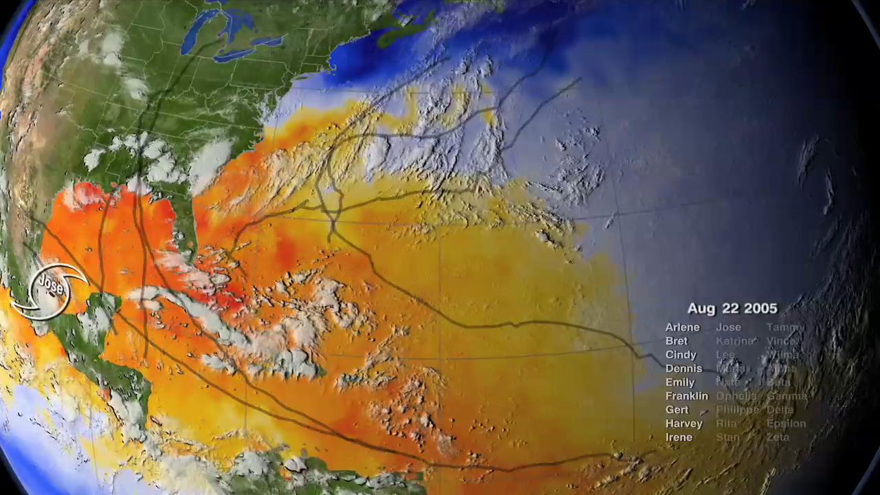
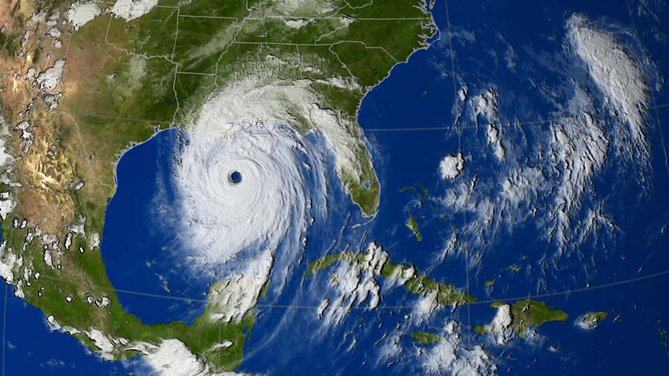
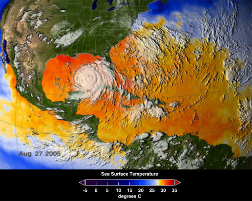
Many records were broken during the 2005 Atlantic hurricane season including the most hurricanes ever, the most category 5 hurricanes, and the most intense hurricane ever recorded in the Atlantic as measured by atmospheric pressure. This visualization shows all 27 named storms that formed in the 2005 Atlantic hurricane season and examines some of the conditions that made hurricane formation so favorable.

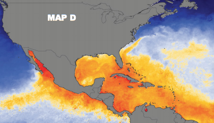
The animation begins by showing the regions of warm water that are favorable for storm development advancing northward through the peak of hurricane season and then receding as the waters cool. The thermal energy in these warm waters powers the hurricanes. Strong shearing winds in the troposphere can disrupt developing young storms, but measurements indicate that there was very little shearing wind activity in 2005 to impede storm formation.

Sea surface temperatures, clouds, storm tracks, and hurricane category labels are shown as the hurricane season progresses.

This visualization shows some of the actual data that NASA and NOAA satellites measured in 2005 - data used to predict the paths and intensities of hurricanes. Satellite data play a vital role in helping us understand the land, ocean, and atmosphere systems that have such dramatic effects on our lives.

Credit: NASA Scientific Visualization Studio

Read More...

Global Precipitation: Rain and Snow Annotated Visualizations

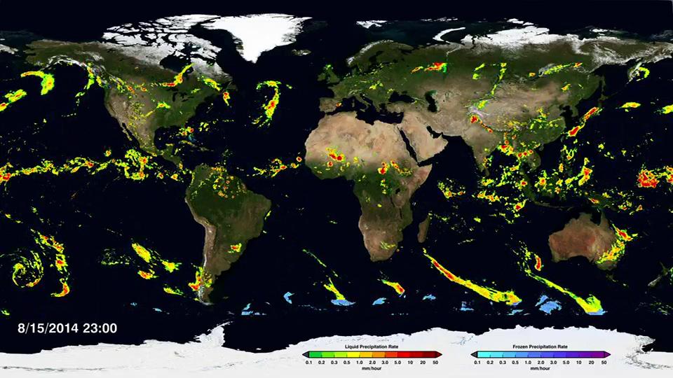
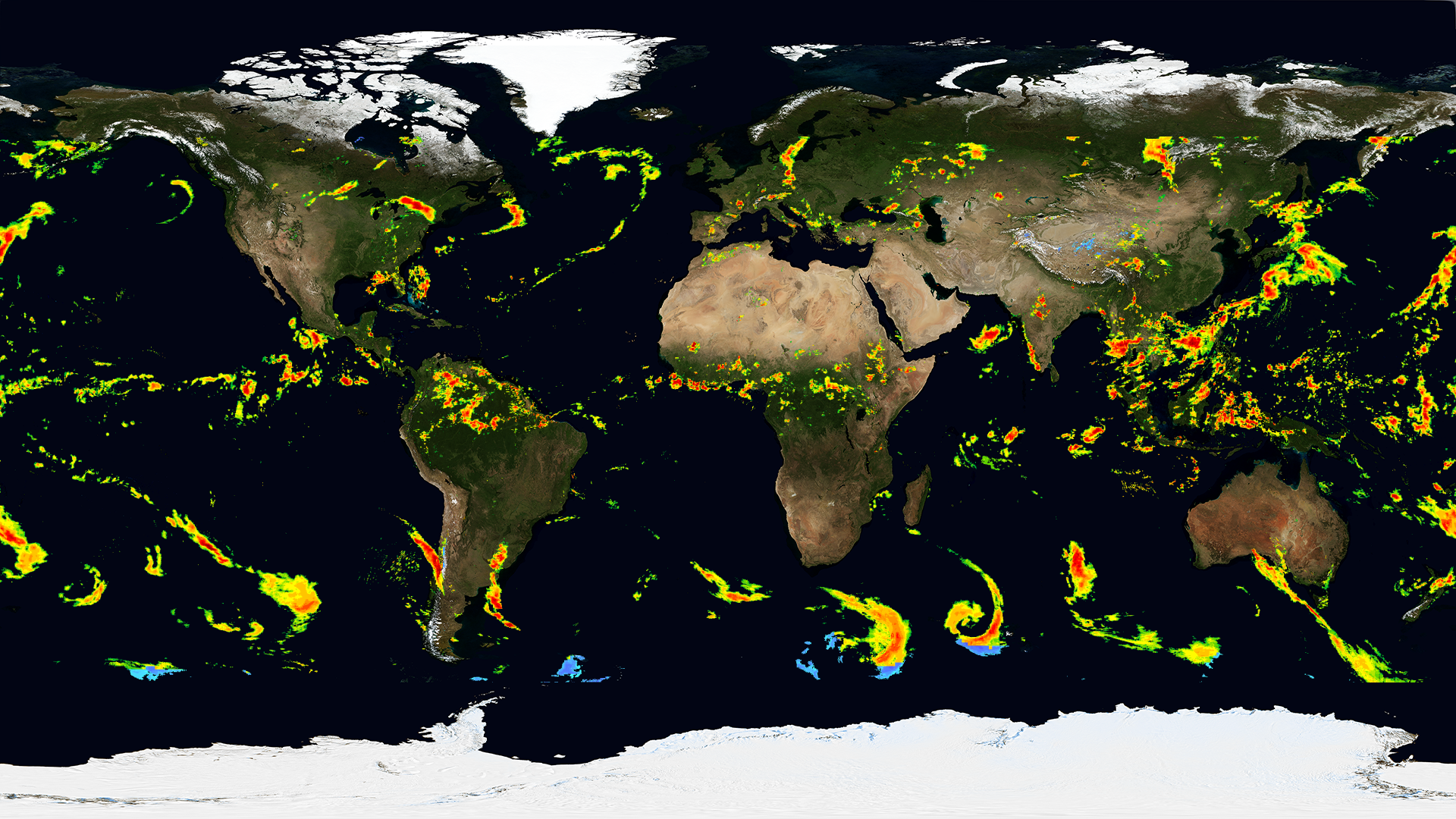
This animation shows global precipitation rates from April 1-Sept. 30, 2014. Separate color keys show rates of liquid precipitation (e.g., rain) and frozen precipitation (e.g., snow). Highest rainfall rates are shown in orange and red, lowest in green and yellow. Highest snowfall rates are shown in purple and blue; lowest in pale blue.

NASA's Global Precipitation Measurement mission produces global maps of rainfall and snowfall. The GPM Core Observatory launched on Feb. 27, 2014 as a collaboration between NASA and the Japan Aerospace Exploration Agency and acts as the standard to unify precipitation measurements from a network of 12 satellites. The result is NASA's Integrated Multi-satellitE Retrievals for GPM data product, called IMERG, which combines all of these data from 12 satellites into a single, seamless map.

The map covers provides the most detailed information on everything from light rain to heavy rain and snow and is updated every half hour, allowing scientists to see how rain and snowstorms move around nearly the entire planet. As scientists work to understand all the elements of Earth's climate and weather systems, and how they could change in the future, GPM provides a major step forward in providing the scientific community comprehensive and consistent measurements of precipitation.

Credit: NASA Scientific Visualization Studio

Read More...

Seasonal Ice (2012) Non-Annotated Visualizations

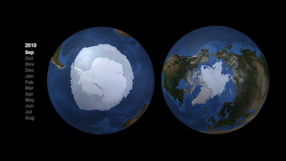
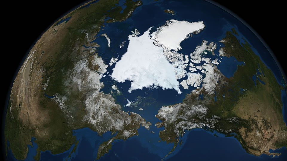
Seen side-by-side, snow and sea ice in the Northern and Southern Hemispheres pulse at exact opposite times of year, constantly out of phase. The extent of yearly change at the extreme poles of our planet is an annual pattern that illustrates that similar forces are at work on distant parts of the Earth. Moderate Resolution Imaging Spectroradiometer (MODIS) data from the near-polar-orbiting Terra and Aqua satellites were used for this visualization.

For more information, visit the Arctic Sea Ice Gallery.

Credit: NASA Scientific Visualization Studio

Scale, Proportion, and Quantity

The Earth's system is characterized by the interaction of processes that take place on molecular (very small) and planetary (very large) spatial scales, as well as on short and long time scales. Scientific visualizations allow us to experience Earth processes at faster speeds, and at manageable smaller scales, facilitating data analysis and enhancing understanding.

Ice Flow (2011) Non-Annotated Visualizations

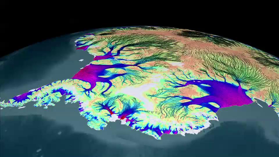
Harsh snows have blanketed Antarctica for so long that the continent has built up an ice sheet a mile thick from bedrock to surface in most places. Despite the ice cap's grip on the rocky landmass below, friction can only hold back the ice so much. This map from NASA reveals icy Antarctica as a landscape of constant movement. NASA scientists at the Jet Propulsion Laboratory and UC Irvine have charted this movement for the first time, using Canadian, Japanese and European satellite data to create a record of the speed and direction of ice flow across the entire continent. The map reveals glaciers and tributaries in patterned flows stretching hundreds of miles inland, like a system of rivers and creeks. Slow-moving flows found in largely unexplored East Antarctica defied previous understanding of ice migration. And scientists discovered a ridge that splits Antarctica from east to west. Explore the visualizations below to see the new benchmark map scientists can use to study the extent and speed of changes to the largest ice sheet in the world.

In the first video, slow, interior flows have been sped up to make them more visible. The colors represent the real flow velocity magnitude.

In the second video, all flows are shown at the same scale. At this scale, only the fastest flows are visible.

In the third video, velocity magnitude colors have been removed and the direction of glacial flow stands out clearly against the icy background.

Credit: NASA Scientific Visualization Studio, Goddard Space Flight Center and Jet Propulsion Laboratory

Read More...

Invisible Earth Annotated Visualization

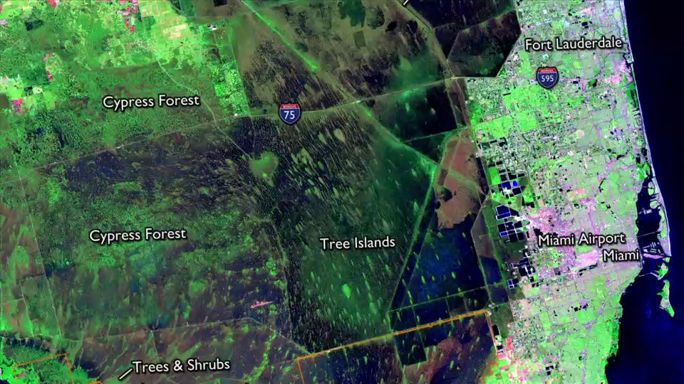
In our photo-saturated world, it's natural to think of satellite images as snapshots from space. But they aren't. A satellite image is created by combining measurements of the intensity of certain wavelengths of light, both visible and invisible to humans. When we combine measurements of visible light, the resulting image is referred to as true color, or similar to what our eyes would see. When we use measurements of non-visible light (such as infrared or microwave), the resulting image is false color. Features may appear differently than we'd expect but these colors help scientists interpret the data. Watch the video to see how distinct combinations of light are combined to create powerful and informing satellite views of our planet.

Credit: NASA Earth Observatory

Read this article from NASA's Earth Observatory to learn more about false color imaging: http://earthobservatory.nasa.gov/Features/FalseColor/.

California Drought Non-Annotated Visualizations

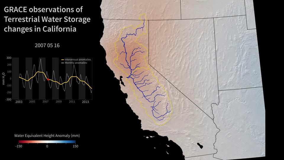
The NASA Gravity Recovery and Climate Experiment (GRACE) mission, which launched in 2002, maps changes in Earth's gravity field resulting from the movement of water over the planet. As water moves around the globe — for example, due to flooding in some regions and drought in others — GRACE acts like a 'scale in the sky,' mapping the regions of Earth that are gaining or losing water each month. The GRACE mission has been particularly successful in monitoring the melting of the Greenland and Antarctic ice sheets, and in mapping changing freshwater storage on land.

This animation shows how the total amount of water (all of the snow, surface water, soil moisture and groundwater) varies in space and time, with the passage of dry seasons and wet seasons as well as with flooding, drought and transport due to water management. Blue colors represent wetter than average conditions (relative to the 2002-2013 time period) and the red colors represent drier than average conditions. The graph at the left shows the monthly changes for the average of map region outlined in yellow. The yellow line in the graph at the left shows interannual variations.

The Sacramento and San Joaquin River basins are outlined in yellow and the rivers and their tributaries are shown by the blue lines. The basins include California's Central Valley, the most productive agricultural region in the United States. Ongoing drought in California has drained the state of nearly 15 cubic kilometers (12 million acre feet; 4 trillion gallons) of water in each of the three years from 2012-2014. Much of the loss is a result of groundwater depletion. Limited rainfall and snowmelt throughout the state has forced agriculture and cities to rely more heavily on groundwater reserves, resulting in rapid depletion of the aquifer beneath the Central Valley. At least 50% of the annual water loss is due to the removal of groundwater.

Credit: NASA

Read More...

Typhoon Hagupit (2014) Non-Annotated Visualizations

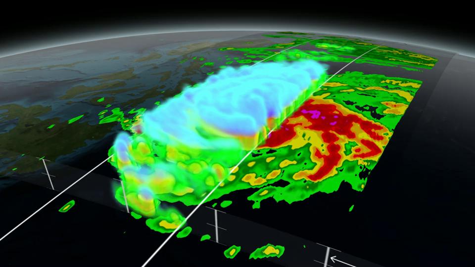
On December 5, 2014 (1032UTC) the Global Precipitation Measurement (GPM) mission's Core Observatory flew over Typhoon Hagupit as it headed towards the Philippines. A few hours later at 1500 UTC (10 a.m. EST), Super Typhoon Hagupit's maximum sustained winds were near 130 knots (149.6 mph/241 kph), down from 150 knots (172 mph/277.8 kph). Typhoon-force winds extend out 40 nautical miles (46 miles/74 km) from the center, while tropical-storm-force winds extend out to 120 miles (138 miles/222 km).

The GPM Core Observatory carries two instruments that provide information on the location and intensity of rain and snow, which defines a crucial part of the storm structure – and how it will behave. The GPM Microwave Imager observes the type and amount of precipitation (rain, snow, ice, etc.) , and the Dual-frequency Precipitation Radar can peer through the clouds to look at precipitation in 3-dimensions.

GPM's microwave and radar data are an essential part of the forecasters' toolbox, which includes other low Earth orbit and geostationary satellites, that they use to monitor tropical cyclones and hurricanes.

The GPM Core Observatory builds on the Tropical Rainfall Measuring Mission (TRMM), which ended in 2015 after 18 successful years of data collection. GPM's new high-resolution microwave imager data and the unique precipitation radar data ensure that forecasters and modelers will be able to continue and expand the capabilities to monitor severe weather. All GPM data products can be found at NASA Goddard's GPM data access website.

Watch the Video Interview (2015) with visualizer Kel Elkins for a guided walk through of this visualization starting at 2:17

Credit: NASA Scientific Visualization Studio

Read More...

Stability and Change

The Earth's system exemplifies stability and change. Change and rates of change can be observed and quantified over very short or long periods of time and at various spatial scales (e.g., from landscape level to global processes). Understanding stability and change in Earth processes contributes to a more complete understanding of the Earth system.

Currents of Change (2012) Non-Annotated Visualizations

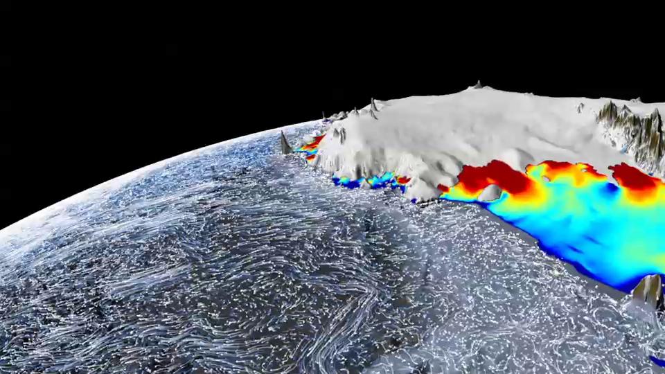
Warm ocean currents circulating off the coast of Antarctica are indirectly contributing to rising global sea levels. As these twisting flows meander around the continent's frozen edges and beneath the underside of floating ice shelves, they're slowly melting the ice from below. Using surface elevation measurements collected during NASA's ICESat mission, scientists have found that this melting is driving most of Antarctica's recent ice losses-particularly in West Antarctica, where inland glaciers that feed into the ice shelves are moving at an accelerated rate. The visualization shows the interaction of modeled ocean currents and Antarctic ice shelves, where red areas represent ice thicker than about 1,800 feet (about 550 meters) and blue areas represent ice thinner than about 650 feet (about 200 meters). Notice how the ice shelves generally become thinner-a rainbow of colors indicates intermediate thicknesses-as they extend farther from land.

Credit: NASA Scientific Visualization Studio

Far Out Flora (2013) Non-Annotated Visualizations

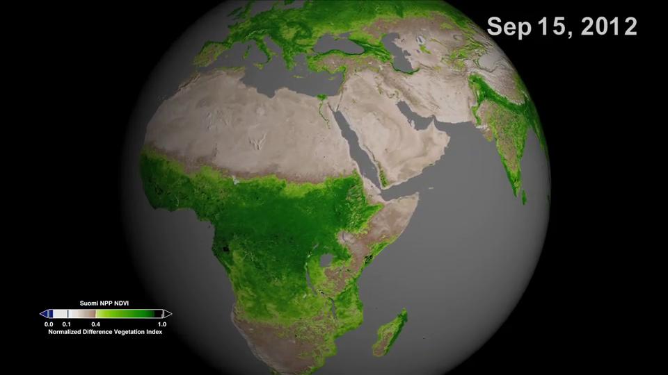
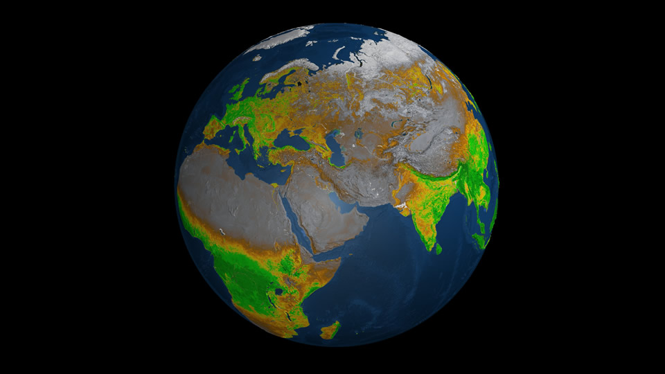
Across the continents, plants flourish or flounder depending on climate, precipitation and human activities. By using advanced satellite sensors that can detect the greenness of plants from space, scientists have amassed a decades-long record of the planet's terrestrial plant life. Data from the NASA/NOAA Suomi NPP satellite, the latest to make these measurements, was used to produce detailed images of plant activity around the world. The dense green areas on the globe represent thriving flora, whereas the light green or tan areas represent sparse plant life or struggling vegetation. The data will be incorporated into U.S. weather prediction models and could help provide early warnings of droughts and fire hazards. Watch the visualization to see how Earth's plant life changes over the course of a year.

Credit: NASA Scientific Visualization Studio

Growing Plains (2015) Non-Annotated Visualizations

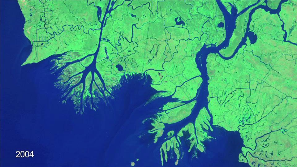
Louisiana's coastline is retreating. Over the next 50 years, scientists expect the Mississippi Delta Plain — a lobe-shaped arc of coastal land that borders the Gulf of Mexico — will lose roughly 3,000 square miles of land. But while portions of the delta plain are disappearing, new land is actually forming in a swampy area about one hundred miles southwest of New Orleans. The Atchafalaya and Wax Lake Outlet deltas have been growing southward by about one square mile per year since the early 1970s. Both deltas are being built by sediment carried by the Atchafalaya River, a distributary of the Mississippi River. The sediment settles into shallow waters and gives rise to sandbars that emerge from the sea in striking fan shapes that can be seen from space. Since 1984, USGS-NASA Landsat satellites have captured images that chronicle the growth of the two deltas. Watch the video to see a time-lapse of their evolution.

Credit: NASA Earth Observatory

Monitoring Sea Level Non-Annotated Visualizations

Sea level: The phrase itself suggests our ocean and seas are have a uniform height. But in fact, the surface of Earth's ocean is not level at all. The height of the ocean surface varies by several feet across the globe because of currents, winds, and temperature fluctuations that cause seawater to expand or contract. For over two decades, NASA and other space agencies have taken precise satellite measurements of sea level, down to the millimeter. The data for this visualization come from instruments called "altimeters," which have been included on TOPEX/Poseidon, Jason-1, and Jason-2 satellites.

The data reveals a surface layer in constant flux, marked by local ripples that rise and fall and massive swells that span oceans. Understanding what causes these differences will only become more important in coming decades, as scientists expect rising sea levels to affect some regions more intensely than others. Watch the visualization for a look at how sea level fluctuates around the world. Ocean surface height is indicated by "bumpiness" and color: average (white), 20 inches (~500mm) above average (dark red), 20 inches (~500 mm) below average (dark blue).

Credit: NASA Scientific Visualization Studio

Read More...

Systems and System Models

Scientific data is used to develop models that describe Earth processes with fidelity and project alternate scenarios when baseline conditions are changed. Scientific models allow us to experiment with and understand phenomena that are too small, too large, too fast, or too slow to detect directly using our senses.

Atmospheric CO2 Model (2014) Annotated Visualizations

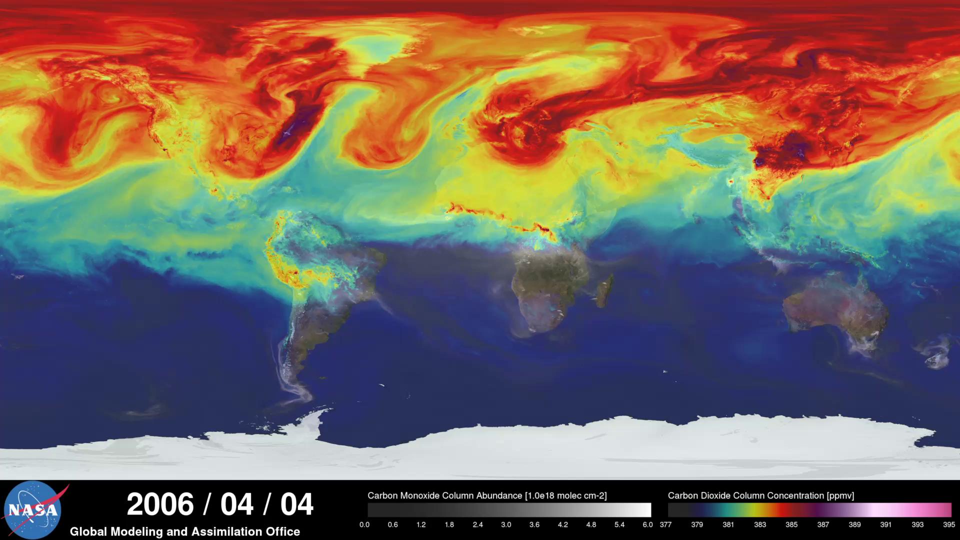
An ultra-high-resolution NASA computer model has given scientists a stunning look at how carbon dioxide in the atmosphere travels around the globe.

Plumes of carbon dioxide in the simulation swirl and shift as winds disperse the greenhouse gas away from its sources. The simulation also illustrates differences in carbon dioxide levels in the Northern and Southern Hemispheres and distinct swings in global carbon dioxide concentrations as the growth cycle of plants and trees changes with the seasons.

The carbon dioxide visualization was produced by a computer model called GEOS-5, created by scientists at NASA Goddard Space Flight Center's Global Modeling and Assimilation Office.

The visualization is a product of a simulation called a "Nature Run." The Nature Run ingests real data on atmospheric conditions and the emission of greenhouse gases and both natural and man-made particulates. The model is then left to run on its own and simulate the natural behavior of the Earth's atmosphere. This Nature Run simulates January 2006 through December 2006.

Credit: NASA Goddard Space Flight Center, NASA Center for Climate Simulation, and William Putman

Read More...

Megadrought (2015) Non-Annotated Visualizations

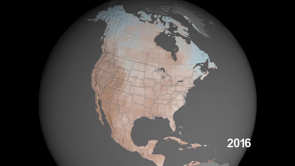
Drought has stricken much of the U.S. Southwest and Central Plains in recent years. But scientists now believe future droughts in the last half of this century could be the worst in the past millennium. Computer model projections of soil moisture show increases in human-produced greenhouse gas emissions are driving up the risk of megadroughts, droughts lasting more than 30 years. A team of researchers led by scientists at NASA's Goddard Institute for Space Studies analyzed model results from two climate scenarios: a moderate scenario where greenhouse gas emissions stop increasing by the year 2050, and a high scenario where emissions continue to rise at their current rate through 2100. In both cases the team found conditions in the western United States are drier and the risk of decades-long drought increases. Watch the videos to see computer simulations that show how soil conditions in North America change under each emissions scenario.

Credit: NASA Scientific Visualization Studio

Planet on Fire (2013) Annotated Visualizations

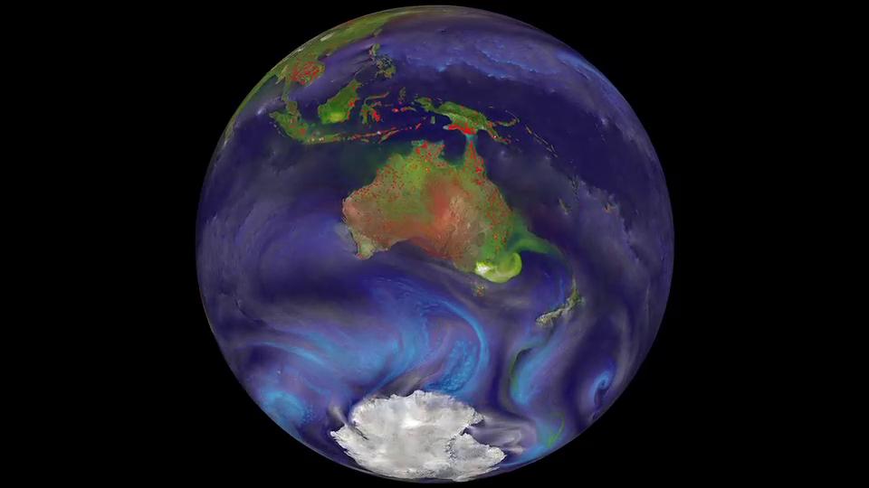
Fire is a powerful force on our planet. From South America's rainforests to Africa's savannas and Australia's highlands, fires touch 30 percent of the land surface. Yet whether naturally occurring or set by humans, fires' effects reach far beyond ravaged lands. Combining satellite observations of fires with a computer model reveals the fires also affect air quality, health, and climate. The Moderate Resolution Imaging Spectroradiometer (MODIS) instruments onboard NASA's Terra and Aqua satellites detect fires as small as 250 meters across and measure carbon aerosols within the smoke. Black carbon (soot) impacts air quality and human health, while black and organic carbon both contribute to climate change. A NASA scientist fed fire and other observations into the GEOS-5/GOCART atmosphere model to simulate aerosols' global travels. In a visualization covering September 1, 2006 to April 10, 2007, watch as myriad fires dotting the continents spew carbon-laced smoke clouds that expand and twist along the winds.

Credit: NASA Goddard Space Flight Center, NASA Center for Climate Simulation, and William Putman

K-12 Lessons

Elementary School

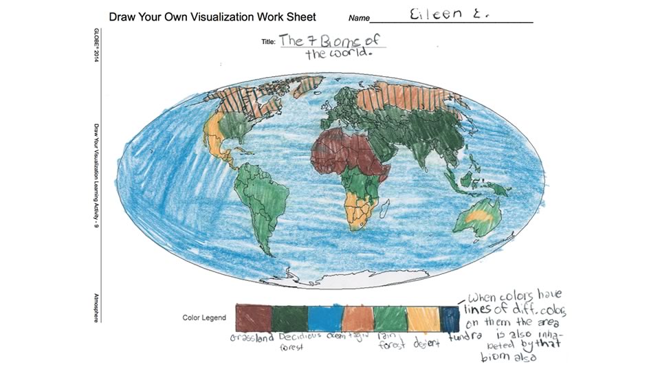
Draw Your Own Visualization

Students learn about visualization elements by designing and drawing their own visualizations.
Grade Level: K-5

Exploring Relationships Between Two Variables

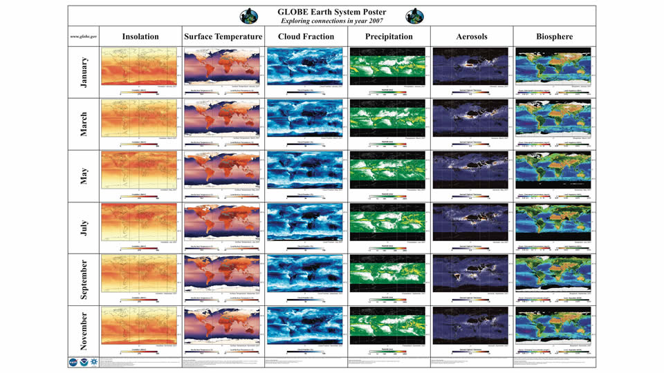
By examining a time series of environmental data maps, students work in teams to explore the connections between parts of the Earth system.

This activity is part of the GLOBE Earth System Poster Learning Activities http://www.globe.gov/documents/10157/334459/Earth_System_Poster_07_Activities.pdf. The images can be used with students to find patterns among different environmental data, understand the relationship among different environmental parameters, and understand how the data changes seasonally and over longer time scales.

A digital version of the poster is provided by the MY NASA DATA project for additional years and to enables interactive exploration of the data in more detail. http://mynasadata.larc.nasa.gov/globe/

Grade Level: k-5

How does color help us understand images from space?

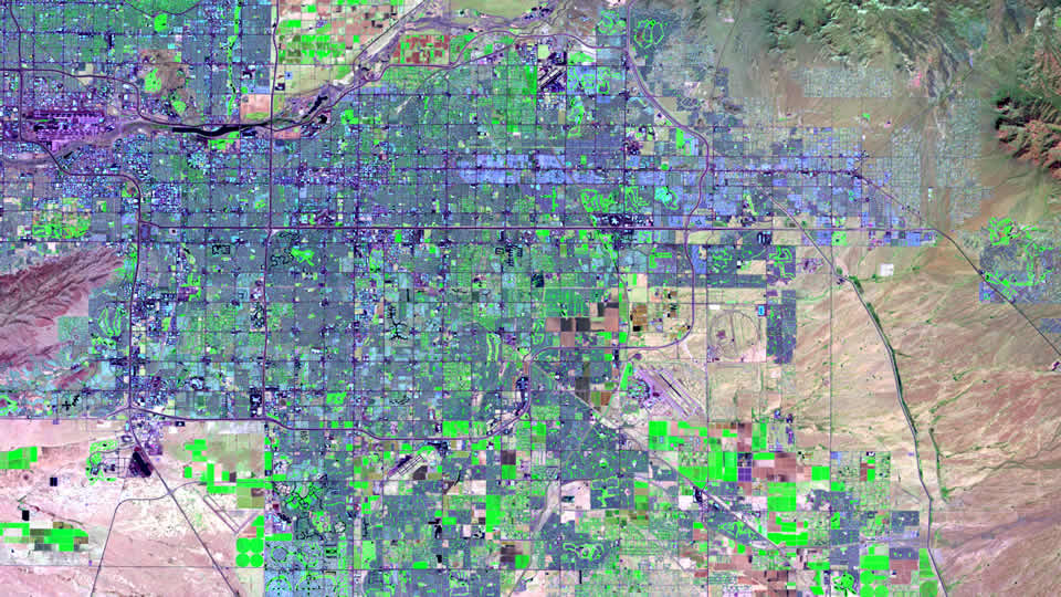
Students interpret colors in a range of satellite images to recognize global vegetation patterns. They distinguish between true color and false color images and examine how geographers and scientists use false color images to study the Earth's surface.

Grade Level: K-5

MY NASA DATA: Rock Star Precipitation

In this activity students assume the roles of musicians planning a world tour and analyze precipitation data from tour cities to predict the best time of year to perform in these areas. Step-by-step instructions for use of the MY NASA DATA Live Access Server (LAS) guide students through selecting a data set, importing the data into a spreadsheet, creating graphs, and analyzing data plots.

Grade Level: K-5

Vertical Height of the Atmosphere

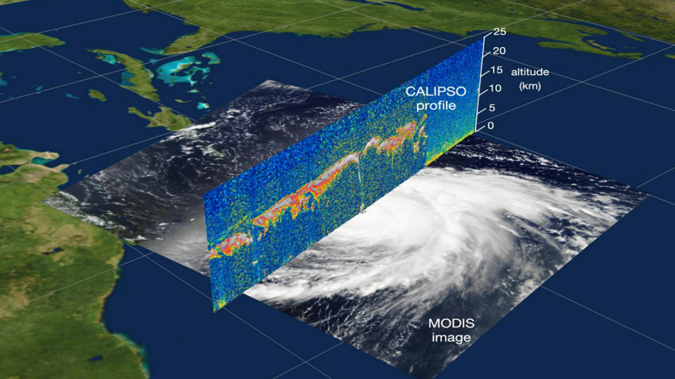
This lesson includes four activities. Activity 1 introduces concepts related to distance, including length and height and units of measurement. Students are asked to make comparisons of distances. In activity 2, students learn about the vertical profile of the atmosphere. They work with a graph and plot the heights of objects and the layers of the atmosphere. In activity 3, students learn about other forms of visual displays using satellite imagery. They compare images of a hurricane using two different satellite images. One image is looking down on the hurricane from space, the other looks (from CALIPSO) through the hurricane to display a profile of the hurricane. Activity 4 reinforces the concept of the vertical nature of the atmosphere. Students will take a CALIPSO satellite image that shows a profile of the atmosphere and use this information to plot mountains and clouds on their own graph of the atmosphere.

Grade Level: K-5

What Are Physical and Human-made Features?

Students identify physical and human-made features using satellite images. They match images of physical features with definitions and identify physical and human features in several images of United States cities.

Grade Level: K-5

Middle School

Blue Marble Matches: Using Earth for Planetary Comparisons

In this activity students are introduced to geologic processes on Earth and model how scientists better understand other planetary bodies in the solar system through comparisons with our Earth.

Grade Level: 6-8

Climate Change Online Lab

Students use NASA's Global Climate Change website to research five key indicators of Earth's climate health and use this information, shared in their expert groups, to create an informative poster about their assigned key indicator.

Grade Level: 6-8

Draw Your Own Visualization

Students learn about visualization elements by designing and drawing their own visualizations.
Grade Level: 6-8

Exploring Relationships Between Two Variables

By examining a time series of environmental data maps, students work in teams to explore the connections between parts of the Earth system.

This activity is part of the GLOBE Earth System Poster Learning Activities http://www.globe.gov/documents/10157/334459/Earth_System_Poster_07_Activities.pdf. The images can be used with students to find patterns among different environmental data, understand the relationship among different environmental parameters, and understand how the data changes seasonally and over longer time scales.
A digital version of the poster is provided by the MY NASA DATA project for additional years and to enables interactive exploration of the data in more detail. http://mynasadata.larc.nasa.gov/globe/
Grade Level: 6-8

Geographical Influences on Climate

Climatograms from different U.S. locations are used to observe patterns in temperature and precipitation. After describing geographical features near these locations, students use graphical data to compare and identify the effects that mountains, oceans, elevation, and latitude have on temperature and precipitation.

Grade Level: 6-8

Hurricane Katrina: A Problem-Based Learning Module

This problem-based learning module asks students to consider how climate change could impact the frequency and intensity of hurricanes. They study the trends and impacts of hurricanes on coastal regions and are guided through numerous resources to explore this question for a final report.

Grade Level: 6-8

Learning to Use Visualizations

This activity introduces students to the idea of using visualizations as a tool for scientific problem-solving. Elevation and temperature are used as examples.

Grade Level: 6-8

Monitoring the Global Environment

This is an online interactive module with lessons plans to teach students about remote-sensing capabilities, spatial and temporal scale, and satellites that are continuously collecting data to monitor our Earth.

Grade Level: 6-8

MY NASA DATA: How Does the Earth's Energy Budget Relate to Polar Ice?

Using a microset of satellite data, students explore the relationship between amounts of vegetation, precipitation, and surface temperature to better understand the Earth's climate zones.

Grade Level: 6-8

MY NASA DATA: Surface Air Temperature Trends of the Caribbean

Students analyze satellite data to determine the changes in near-surface air temperature at different times of the year over the Caribbean Sea.

Grade Level: 6-8

MY NASA DATA: Using Vegetation, Precipitation and Surface Temperature to Study Climate Zones

Using a microset of satellite data, students explore the relationship between amounts of vegetation, precipitation, and surface temperature to better understand the Earth's climate zones.

Grade Level: 6-8

High School

Exploring Color Maps: Using Stratospheric Ozone Data

Through the use of the 5E instructional model, students discover the value of using color maps to visualize data. The activity requires students to create a color map of the ozone hole from Dobson data values derived from the Aura satellite. Students then interpret that map and compare and evaluate different color scales.

Grade Level: 9-12

Hurricane Katrina: A Problem-Based Learning Module

This problem-based learning module asks students to consider how climate change could impact the frequency and intensity of hurricanes. They study the trends and impacts of hurricanes on coastal regions and are guided through numerous resources to explore this question for a final report.

Grade Level: 9-12

Learning to Use Visualizations

This activity introduces students to the idea of using visualizations as a tool for scientific problem-solving. Elevation and temperature are used as examples.

Grade Level: 9-12

Monitoring the Global Environment

This is an online interactive module with lessons plans to teach students about remote-sensing capabilities, spatial and temporal scale, and satellites that are continuously collecting data to monitor our Earth.

Grade Level: 9-12

MY NASA DATA: Ocean Currents and Sea Surface Temperature

Using data-based ocean currents and sea surface temperature maps, students analyze the links between these measurements and draw directional movement of currents.

Grade Level: 9-12

MY NASA DATA: Surface Air Temperature Trends of the Caribbean

Students analyze satellite data to determine the changes in near-surface air temperature at different times of the year over the Caribbean Sea.

Grade Level: 9-12

MY NASA DATA: Using Hovmuller Plots to Better Understand Temperature and Salinity

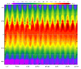
A Hovmuller plot is a diagram that displays data patterns from a selected latitude or longitude over a time period. Through a storyline and several samples, students are introduced to a Hovmuller plot of temperature data along a longitude in the eastern United States. Students then create salinity and precipitation plots using data from the MY NASA DATA Live Access Server.

Grade Level: 10-12

Interviews

Interviews

Interview with NASA visualizer Kel Elkins

Follow along as NASA visualizer Kel Elkins walks you through three visualizations (Dust Crossing, Typhoon Hagupit, and Aquarius Sea Surface Salinity) and answers questions about his work, education, and career.

Interview with Global Precipitation Measurement Mission Scientists

In this interview, GPM scientists answer student questions about the IMERG Global Precipitation dataset and the GPM mission. The questions and what time they're answered in the video are below:

  1. How can the rain that falls in your backyard affect people in Europe? – 00:11
  2. How long did it take to build this technology? Can it track down any other precipitation? – 01:05
  3. When do the most strange precipitation patterns occur throughout the world and where do these patterns occur? – 01:45
  4. Why is it so important that we study precipitation? – 02:41
  5. Which areas of the world get the most precipitation? The least? – 03:49
  6. Why do certain parts of the U.S. get more precipitation than others? – 05:08
  7. How does precipitation affect certain ecosystems? – 05:56
  8. there a pattern that these weather conditions follow on a yearly basis? – 08:07
  9. How do these patterns change from year to year? – 09:00
  10. How is it [GPM] able to tell what type of precipitation is under the clouds? – 07:31
  11. How is this different from the technology we already have? – 06:49
  12. Thanks to the new way of taking data, have any previous assumptions been debunked, or proven? – 10:25

Inquiry Teaching

Inquiry Teaching

Inquiry Teaching with Visualizations

The many non-narrated and non-annotated visualizations above provide excellent opportunities for inquiry-based learning. This paper describes an introductory approach to teaching with these unlabeled visualizations.