Hurricane Resources
Narrated Products
Towers in the Tempest
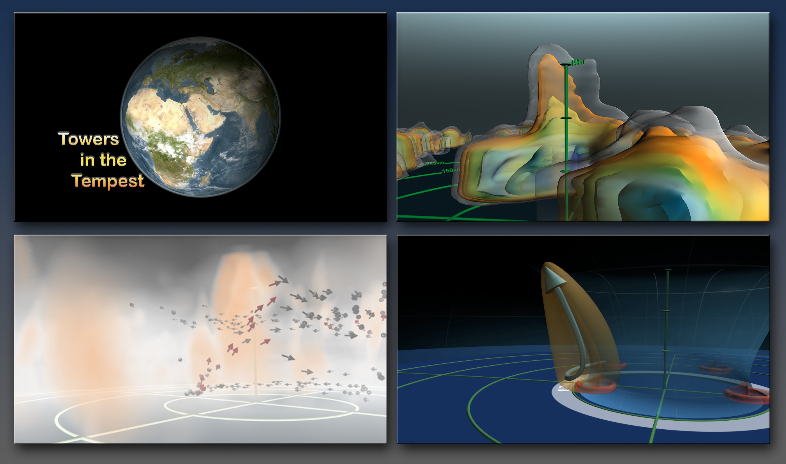
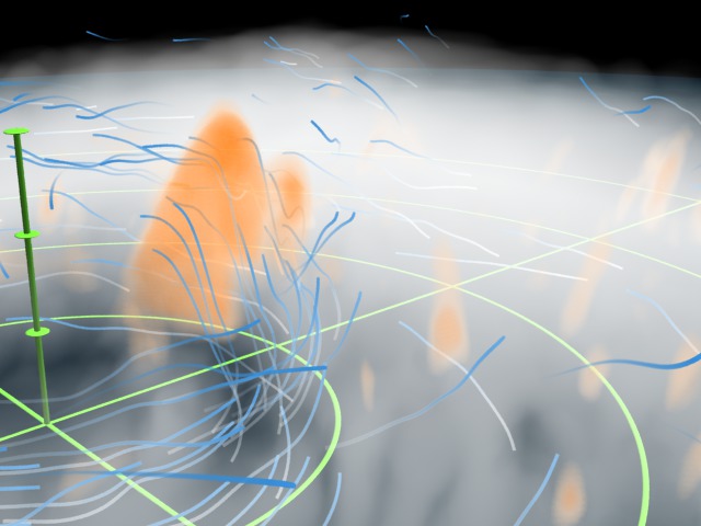
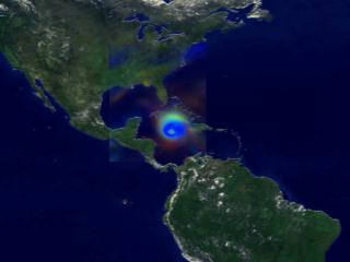
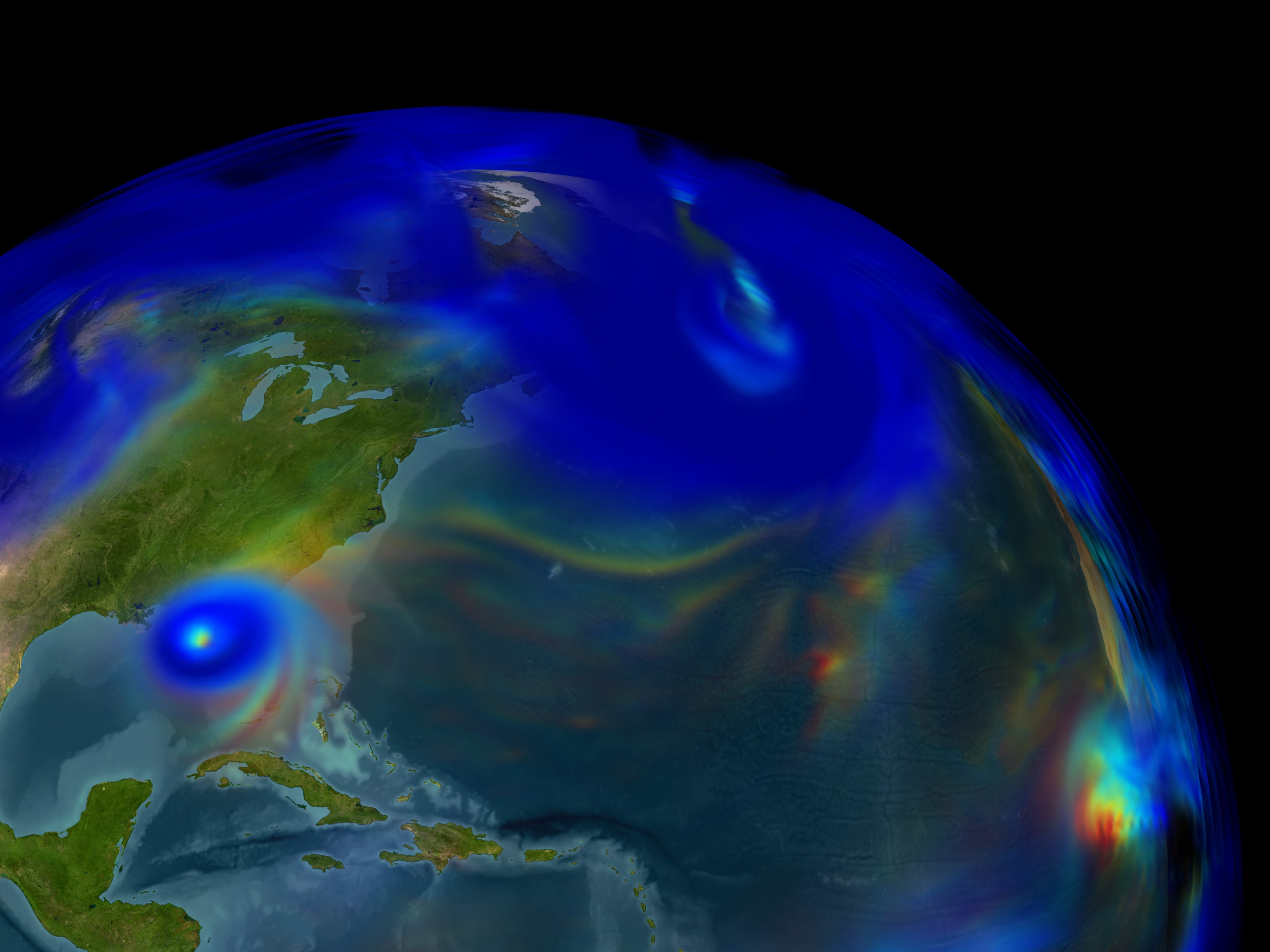
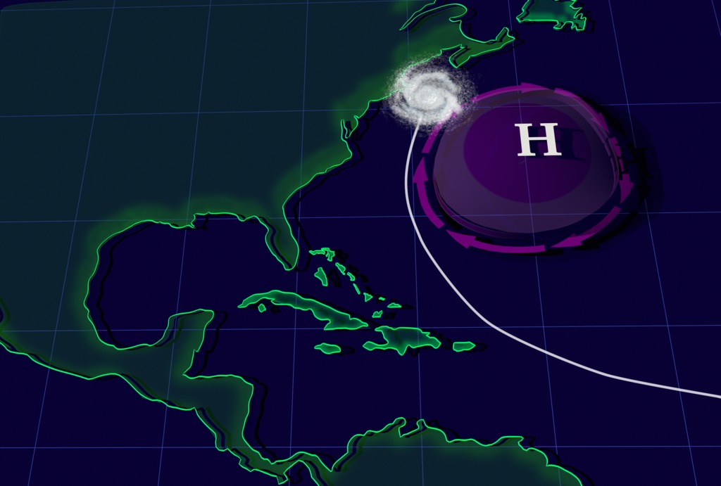
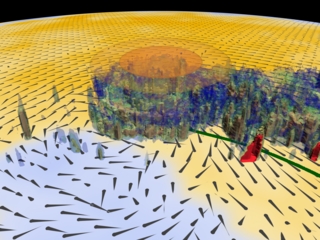
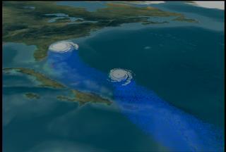
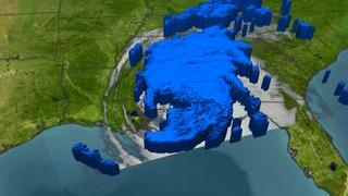
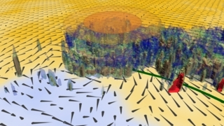
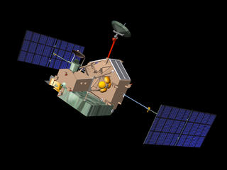
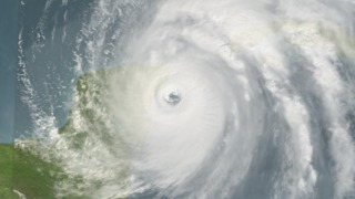
Go to this pageThis visualization won Honorable Mention in the National Science Foundation's Science and Engineering Visualization Challenge in September 2007. It was also shown during the SIGGRAPH 2008 Computer Animation Festival in Los Angeles, CA. 'Towers in the Tempest' is a 4.5 minute narrated animation that explains recent scientific insights into how hurricanes intensify. This intensification can be caused by a phenomenon called a 'hot tower'. For the first time, research meteorologists have run complex simulations using a very fine temporal resolution of 3 minutes. Combining this simulation data with satellite observations enables detailed study of 'hot towers'. The science of 'hot towers' is described using: observed hurricane data from a satellite, descriptive illustrations, and volumetric visualizations of simulation data. The first section of the animation shows actual data from Hurricane Bonnie observed by NASA's Tropical Rainfall Measuring Mission (TRMM) spacecraft. Three dimensional precipitation radar data reveal a strong 'hot tower' in Hurricane Bonnie's internal structure. The second section uses illustrations to show the dynamics of a hurricane and the formation of 'hot towers'. 'Hot towers' are formed as air spirals inward towards the eye and is forced rapidly upwards, accelerating the movement of energy into high altitude clouds. The third section shows these processes using volumetric cloud, wind, and vorticity data from a supercomputer simulation of Hurricane Bonnie. Vertical wind speed data highlights a 'hot tower'. Arrows representing the wind field move rapidly up into the 'hot tower, boosting the energy and intensifying the hurricane. Combining satellite observations with super-computer simulations provides a powerful tool for studying Earth's complex systems. The complete script is available here . The storyboard is available here . There is also a movie of storyboard drawings with narration below. ||
27 Storms: Arlene to Zeta
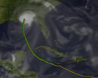
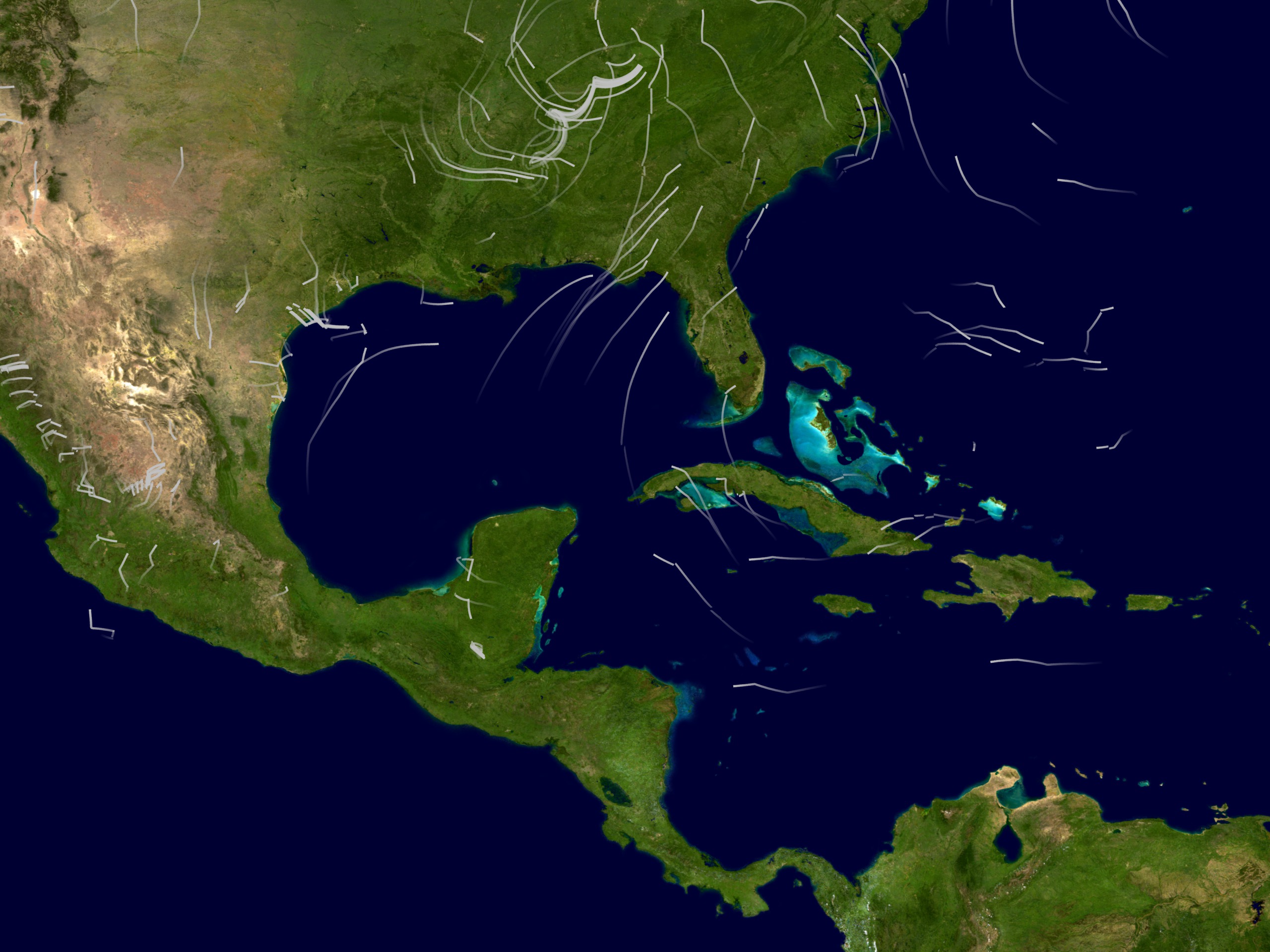
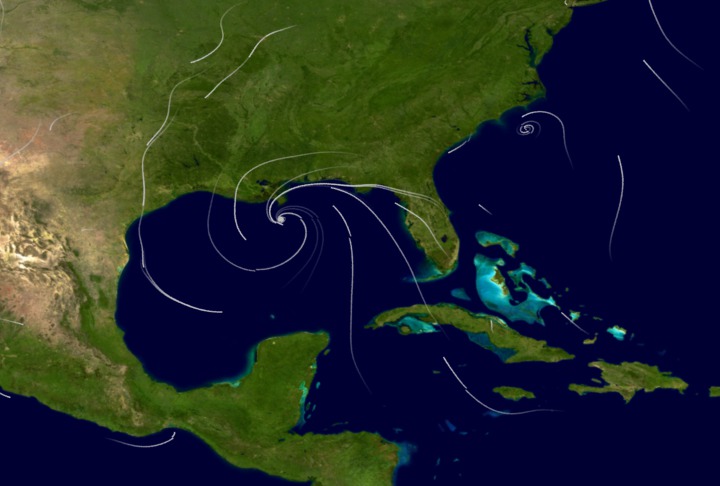
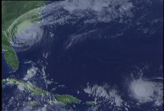
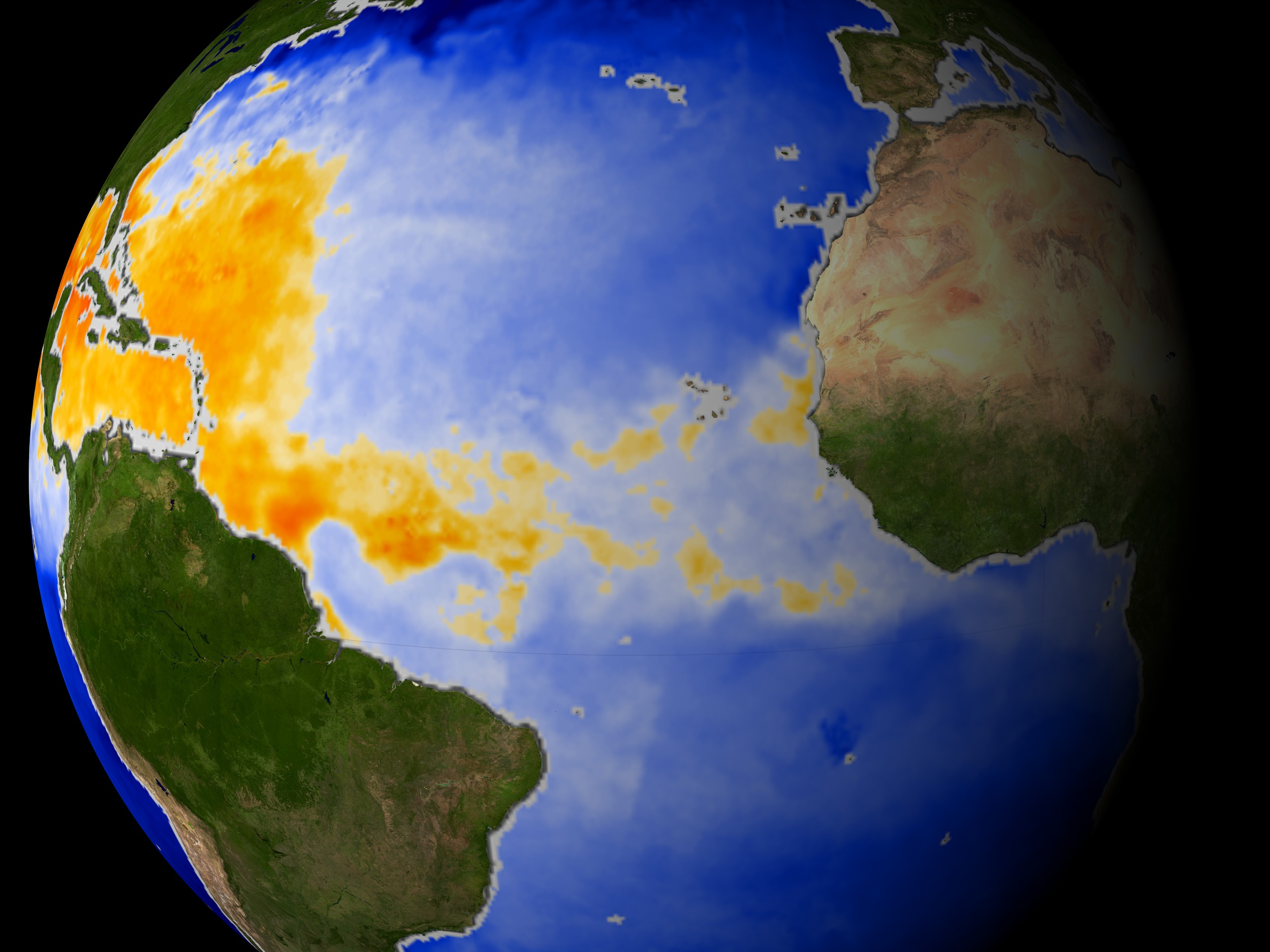
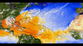
Go to this pageMany records were broken during the 2005 Atlantic hurricane season including the most hurricanes ever, the most category 5 hurricanes, and the most intense hurricane ever recorded in the Atlantic as measured by atmospheric pressure. This visualization shows all 27 named storms that formed in the 2005 Atlantic hurricane season and examines some of the conditions that made hurricane formation so favorable.The animation begins by showing the regions of warm water that are favorable for storm development advancing northward through the peak of hurricane season and then receding as the waters cool. The thermal energy in these warm waters powers the hurricanes. Strong shearing winds in the troposphere can disrupt developing young storms, but measurements indicate that there was very little shearing wind activity in 2005 to impede storm formation.Sea surface temperatures, clouds, storm tracks, and hurricane category labels are shown as the hurricane season progresses.This visualization shows some of the actual data that NASA and NOAA satellites measured in 2005 — data used to predict the paths and intensities of hurricanes. Satellite data play a vital role in helping us understand the land, ocean, and atmosphere systems that have such dramatic effects on our lives.NOTE: This animation shows the named storms from the 2005 hurricane season. During a re-analysis of 2005, NOAA's Tropical Prediction Center/National Hurricane Center determined that a short-lived subtropcial storm developed near the Azores Islands in late September, increasing the 2005 tropical storm count from 27 to 28. This storm was not named and is not shown in this animation.'27 Storms: Arlene to Zeta' played in the SIGGRAPH 2007 Computer Animation Festival in August 2007. It was also a finalist in the 2006 NSF Science and Engineering Visualization Challenge. ||
Earth System Science: Summary
Atlantic Hurricane/Storm Summary
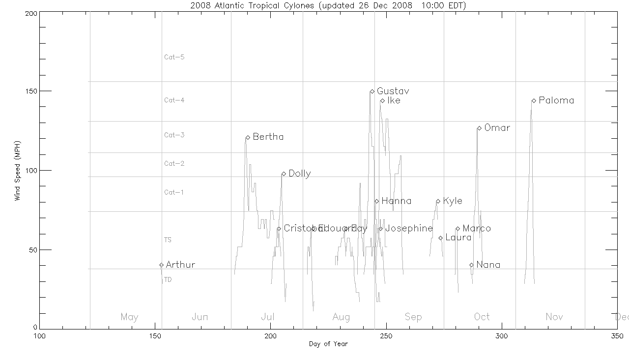
Go to this pageThese still images shows plots of time vs. wind speed for each tropical storm/hurricane of the Atlantic Hurricane seasons. Horizontal lines indicate wind speed category thresholds. A line plot for each storm shows the storm's name and a marker at the peak wind speed.The plot for the current year automatically updates every 2 hours during hurricane season. || 2018 Atlantic hurricanes and storms || hurricane_plot2018.gif (1280x720) [15.0 KB] ||
Earth System Science: Modeling
- Visualization
- Visualization
- Visualization
- Visualization
Earth System Science: Research
Hurricane Bonnie Dissolving 'Crystal Cathedral'
Go to this pageA fly in to a set of nested 3D isosurfaces of constant precipitation density for Hurricane Bonnie, measured by TRMM on August 22, 1998. The isosurfaces a removed one-by-one until only the highest density surface remains, then the surfaces are restored in reverse order. || a001150.00005_print.png (720x480) [442.4 KB] || bonnie_320X240_highres_pre.jpg (320x240) [9.8 KB] || a001150_pre.jpg (320x242) [8.6 KB] || a001150.webmhd.webm (960x540) [8.7 MB] || a001150.dv (720x480) [180.5 MB] || a001150.mp4 (640x480) [10.2 MB] || bonnie_320X240_highres.qt (320x240) [28.2 MB] || a001150.mpg (352x240) [6.8 MB] ||
NASA Scientists Research Tropical Cyclones
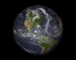
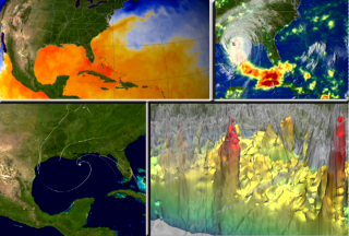
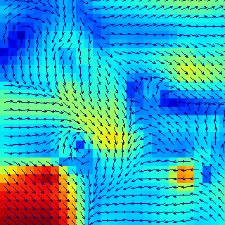
Go to this pageFrom hot towers to phytoplankton blooms, NASA's cutting-edge hurricane research has been revealing never-before-seen aspects of these giant storms for over a decade. The past three years have seen great progress in the areas of intensity monitoring and 3-D modeling of hurricanes. In 2006, scientists at NASA and other institutions have more tools than ever to study these storms using the very latest in ground, air, and space-based technology. The top left window shows sea surface temperature and clouds. Orange and red colors represent ocean temperatures at 82 degrees Fahrenheit or higher. This is the temperature required for hurricanes to form. The bottom left window shows wind analysis model data from NASA's Modeling, Analysis, and Prediction (MAP '05) program. The top right window shows Rainfall Accumulation for Hurricane Katrina from the TRMM spacecraft. The bottom right window shows Energy-releasing deep convective clouds (to 16 km) in the eyewall of Hurricane Katrina, called 'Hot Towers', on August 28 occurred while the storm was intensifying to a category 5 classification. ||
Unmaned Aerosonde Braves Hurricane Winds
Go to this pageThe aerosonde will make continuous observation of the temperature, moisture, and wind structure of the near-surface hurricane environment providing real-time detailed observations to NOAA forecasters. Aerosonde and its sophisticated instruments will try to detect signals of rapid intensity changes in the hurricane. Enhancing this predictive capability would not only save our economy billions of dollars, but more importantly, it would save countless lives. ||
Dropsonde Hurricane Sensor
Go to this pageDropsondes Away! - Described by a researcher as 'Pringles cans with parachutes', scientists dropped sensors called 'dropsondes' into 2001's Hurricane Erin to gain temperature, pressure, moisture and wind readings throughout different locations in the hurricane. An ER-2 allows for eight dropsondes deliveries, while the fully staffed DC-8 plane drops as many as 15 dropsondes within the hurricane. ||
ARGO Float Animation #2
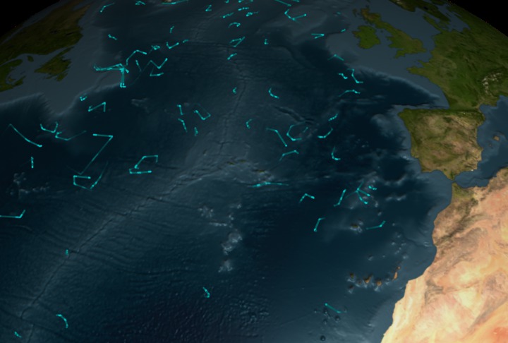
Go to this pageThis visualization shows the locations of the ARGO buoy array over time. When the buoys above water, the lines are brighter; when the buoys are under water, the lines are fainter. The ARGO buoys measure ocean salinity, column temperature, and current velocities. This version of the visualization uses a faster camera move than version #1 (animation 3204). ||
ARGO Float Animation #1
Go to this pageThis visualization shows the locations of the ARGO buoy array over time. When the buoys are above water, the lines are brighter; when the buoys are under water, the lines are fainter. The ARGO buoys measure ocean salinity, column temperature, and current velocities. This version of the visualization uses a slow camera move. ||
Cold Water Upwelling Promotes Phytoplankton Blooms
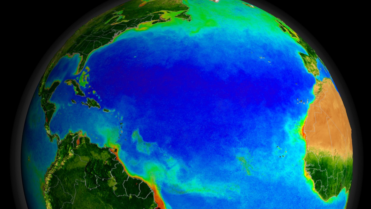
Go to this pageCarbon is the root of all life on Earth, and as it circulates through our biosphere, the Earth's state of health responds. Whenever the size of phytoplankton colonies in the ocean changes, it affects the amount of carbon absorbed from the atmosphere. These blooms are highly dependent on surrounding environmental conditions. As a hurricane passes over the tropical waters of the Atlantic, it draws up cold water from deep below the warmer surface. As the cooler water rises, it brings with it phytoplankton and nutrients necessary for life. These microscopic plants then bloom in higher than average amounts. Bigger storms cause larger plankton blooms and more plankton absorb a greater amount of carbon from our atmosphere. Scientists are still trying to determine how much carbon dioxide might be removed by such a process. ||
SeaWiFS Biosphere Data over the North Atlantic (Slow Version)
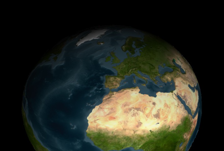
Go to this pageThe SeaWiFS instrument aboard the Seastar satellite has been collecting ocean data since 1997. By monitoring the color of reflected light via satellite, scientists can determine how successfully plant life is photosynthesizing. A measurement of photosynthesis is essentially a measurement of successful growth, and growth means successful use of ambient carbon. This animation represents nearly a decade's worth of data taken by the SeaWiFS instrument, showing the abundance of life in the sea. Dark blue represents warmer areas where there is little life due to lack of nutrients, and greens and reds represent cooler nutrient-rich areas. The nutrient-rich areas include coastal regions where cold water rises from the sea floor bringing nutrients along and areas at the mouths of rivers where the rivers have brought nutrients into the ocean from the land.This animation is essentially the same as animation #3450 with a few minor changes and runs at half the speed. ||
Earth System Science: Hurricane Recipe
- Produced Video
- Visualization
- Visualization
- Visualization
- Visualization
- Visualization
- Animation
- Animation
- Animation
Severe Weather
El Niño Hurricane Connection
Go to this pageAnimation compares the effects of La Niña and El Niño on the formation of Atlantic Hurricanes. El Niño tends to suppress the formation of hurricanes by steering the subtropical jet stream into the hurricanes' path and shearing off the tops of the storms before they develop into full intensity. During La Niña, the jet stream moves north, and hurricanes tend to more easily evolve without interference. ||
Wind Anomalies During El Niño/La Niña Event of 1997-1998 (WMS)
Go to this pageThe El Niño/La Niña event in 1997-1999 was particularly intense, but was also very well observed by satellites and buoys. Deviations from normal winds speeds and directions were computed using data from the Special Sensor Microwave/Imager (SSMI) on the Tropical Rainfall Measuring Mission (TRMM) satellite. ||
NASA Satellite Reveals Heavy Rainfall Patterns in California
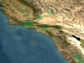
Go to this pageThe collision of a flow of moisture from Hawaii known as a 'Pineapple Express' and a persistent low pressure system are wreaking havoc on California weather. This movie shows rain accumulation in San Diego from Jan. 6 through Jan. 11 based on data from the Tropical Rainfall Measuring Mission (TRMM)-based Multisatellite Precipitation Analysis. The accumulation is shown in colors ranging from green (less than 50 mm of rain) through red (200 mm or more). The TRMM satellite, using the world's only spaceborne rain radar and other microwave instruments, measures rainfall over the ocean. In this case instruments were able to reveal rainfall structure resulting from storms 'riding' the actual Pineapple Express extending toward Hawaii, which is beyond the range of conventional land-based National Weather Service radars.In early 1995, a Pineapple Express hit California, contributing to a season of winter storms that killed 27 people and did $3 billion in damages and costs. A Pineapple Express in mid-October 2003 wreaked havoc from south of Seattle to north of Vancouver Island. Flooding forced more than 3,000 people from their homes. ||
CloudSat, Calipso and MODIS over Central America
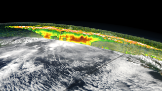
Go to this pageAssociated with tropical thunderstorms are broad fields of cirrus clouds that flow out of the tops of the vigorous storm systems that form over warm tropical oceans. These clouds play a role in how much infrared energy is trapped in Earth's atmosphere. NASA's Tropical Composition, Cloud and Climate Coupling (TC4) mission, which runs from July 16, 2007 through August 8, 2007, aims to document the full lifecycle of these clouds. Observations from four A-Train satellites flying in formation will complement the aircraft measurements with large-scale views of many different features of the atmosphere. Observations from this mission along with previous studies will improve our understanding of what effect a warming climate with rising ocean temperatures will have on these cloud systems. These images over Central America, produced in support of the TC4 mission, show a tropical storm system over Central and South America on August 2, 2006 as measured from multiple satellite sensors, including Aqua MODIS, CloudSat and CALIPSO. In this view from the Pacific Ocean, Panama is on the left and South America is shown on the right. In the following series of still images, each satellite's measurement is shown individually and in combination with the others from the same camera viewpoint. The profile showing CloudSat and CALIPSO data is truncated at a height of twenty kilometers and exaggerated ten times. The land topography is also exaggerated by a factor of ten. ||
Global Lightning Accumulation (WMS)
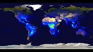
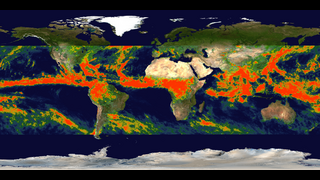
Go to this pageLightning is a brief but intense electrical discharge between positive and negative regions of a thunderstorm. The Lightning Imaging Sensor (LIS) on the Tropical Rainfall Measuring Mission (TRMM) satellite was designed to study the distribution and variability of total lightning on a global basis. The Optical Transient Detector (OTD) was an earlier lightning detector flying aboard the Microlab-1 spacecraft. The data shown here are compiled from LIS (1998-2002) and OTD (1995-1999) observations. Because each satellite saw only a part of the Earth at any one time, these data use complex algorithms to estimate total flash rate based on the flashes observed and the amount of time the satellite views each area.NOTE: This animation is primarily designed to be used through the Web Mapping Services (WMS) protocol. Each frame in the animation actually represents an accumulation of a number of years of data up through a particular day of the year. Because of a limitation in the WMS protocol, each frame is marked only with a single date representing the last date for which the data was accumulated. ||
Global Lightning Flash Rate Density (WMS)
Go to this pageLightning is a brief but intense electrical discharge between positive and negative regions of a thunderstorm.The Lightning Imaging Sensor (LIS) on the Tropical Rainfall Measuring Mission (TRMM) satellite was designed to study the distribution and variability of total lightning on a global basis. The Optical Transient Detector (OTD) was an earlier lightning detector flying aboard the Microlab-1 spacecraft. The data shown here are compiled from LIS (1998-2002) and OTD (1995-1999) observations. Because each satellite saw only a part of the Earth at any one time, these data use complex algorithms to estimate total flash rate density (number of flashes per square kilometer per year) based on the flashes observed and the amount of time the satellite views each area. ||
TOPEX/JASON Sea Level
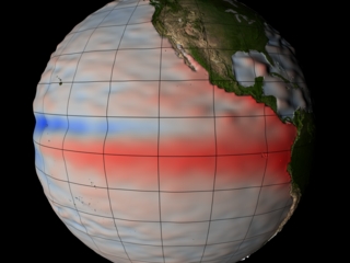
Go to this pageThis visualization shows the relative sea level around the Earth. Sea level is represented by both color (blue=low, red=high) and bumpiness. The range is -500 mm to +500 mm. ||
Sea Surface Height Anomaly, 2003-2005 (WMS)
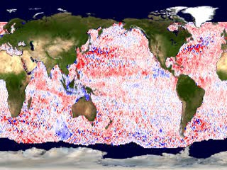
Go to this pageChanges in the normal height of the ocean's surface were observed by the TOPEX/Poseidon altimeter. ||
Satellites
- Link
- Link
- Link
- Link
- Link
- Link
- Link
- Link
- Link
- Link
- Link
- Visualization
- Link
