GPM Captures Super Typhoon Mangkhut Approaching The Philippines
At nearly the same time that the US East Coast was experiencing the arrival of Hurricane Florence, a much more powerful storm was also arriving half a world away in the Philippines—Super Typhoon Mangkhut. While the slow-moving Florence arrived as a Category 1 hurricane that brought record flooding to the Carolinas, less than 7 hours later Mangkhut (known as Ompong in the Philippines) made landfall on the northern main island of Luzon as a full on Category 5 super typhoon with sustained winds reported at 165 mph.
The visualization starts with a view of Integrated Multi-satellitE Retrievals for GPM (IMERG) precipitation rates from 15:11 UTC (11:11 pm PST) 12 September to 15:41 UTC (11:41 pm PST) 13 September 2018 as the storm was making its way across the Philippine Sea headed for Luzon. Before entering the Philippine Sea, Mangkhut passed just north of Guam on the evening of the 10th as a Category 2 typhoon with sustained winds reported at 105 mph by the Joint Typhoon Warning Center (JTWC) causing widespread power outages. The next day on the 11th as it entered the eastern Philippine Sea, Mangkhut underwent a rapid intensification cycle wherein the storm’s intensity shot from Category 2 on the afternoon of the 10th (local time) to Category 5 with sustained winds estimated at 160 mph by JTWC by the evening of the 11th (local time). Mangkhut is estimated to have reached its peak intensity at 18:00 UTC on the 12th (2:00 am PST 13 September) with maximum sustained winds estimated at 180 mph by JTWC, making it the strongest tropical cyclone of the year thus far.
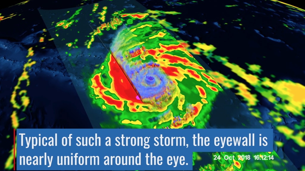
At the start of the visualization, Mangkhut was an extremely powerful Category 5 super typhoon and just approaching its peak intensity. Over the next 24 hours, Mangkhut’s intensity leveled out such that when the GPM core satellite over flew the storm, Mangkhut’s peak intensity was estimated at 165 mph, a still very powerful Category 5 storm. The end of the visualization shows the surface rainfall within Mangkhut as well as a 3D flyby of the storm courtesy of the GPM core satellite, which passed over the storm at around 15:40 UTC (11:40 pm PST) on the 13th. At the surface, a distinct eye is present surrounded by a large area of very heavy to intense rain (shown in dark red and magenta). Further out, heavy rain bands are rotating counter clockwise around the storm’s center. The flyby shows a 3D rendering of the radar structure of Mangkhut using data collected from GPM’s Dual-frequency Precipitation Radar or DPR. At the heart of the storm surrounding the eye is a ring of elevated echo tops associated with Mangkhut’s eyewall. The strong symmetry and continuity of the ring is consistent with an intense tropical cyclone and suggests no inhibiting effects such as dry air or wind shear are affecting the storm. In fact, after these images were taken, Mangkhut would continue on to strike the northern part of Luzon at the same estimated intensity, becoming the strongest typhoon to hit the Philippines since Super Typhoon Haiyan in 2013. So far the storm is being blamed for at least 95 fatalities in the Philippines, many due to a large landslide around the town of Itogon. After crossing Luzon, Mangkhut continued on to strike Hong Kong with winds reported at 121 mph before dissipating over mainland China, where it is being blamed for 6 fatalities.
GPM data is part of the toolbox of satellite data used by forecasters and scientists to understand how storms behave. GPM is a joint mission between NASA and the Japan Aerospace Exploration Agency. Current and future data sets are available with free registration to users from NASA Goddard's Precipitation Processing Center website.
GPM passed over Typhoon Mangkhut on September 13, 2018 at 15:21 UTC. As the camera moves in on the storm, DPR's volumetric view of the storm is revealed. A slicing plane moves across the volume to display precipitation rates throughout the storm. Shades of green to red represent liquid precipitation. Frozen precipitation is shown in cyan and purple.
This video is also available on our YouTube channel.

Color bar for liquid precipitation rates (ie, rain rates). Shades of green represent low amounts of liquid precipitation, whereas shades of red represent high amounts of precipitation.

Color bar for frozen precipitation rates (ie, snow rates). Shades of cyan represent low amounts of frozen precipitation, whereas shades of purple represent high amounts of precipitation.
Credits
Please give credit for this item to:
NASA's Scientific Visualization Studio
-
Visualizers
- Kel Elkins (USRA)
- Greg Shirah (NASA/GSFC)
- Alex Kekesi (Global Science and Technology, Inc.)
-
Scientists
- George Huffman (NASA/GSFC)
- Dalia B Kirschbaum (NASA/GSFC)
- Owen Kelley (George Mason University)
- Stephen Lang (NASA/GSFC)
- Stephen J. Munchak (University of Maryland)
-
Science writer
- Rob Gutro (NASA/GSFC)
-
Technical support
- Laurence Schuler (ADNET Systems, Inc.)
- Ian Jones (ADNET Systems, Inc.)
-
Writer
- Hal Pierce (SSAI)
Release date
This page was originally published on Wednesday, September 19, 2018.
This page was last updated on Wednesday, October 9, 2024 at 12:08 AM EDT.
Series
This page can be found in the following series:Datasets used
-
[GOES]
ID: 22 -
Rain Rates (Surface Precipitation) [GPM: GMI]
ID: 822Credit: Data provided by the joint NASA/JAXA GPM mission.
See all pages that use this dataset -
Volumetric Precipitation data (Ku) [GPM: DPR]
ID: 830Credit: Data provided by the joint NASA/JAXA GPM mission.
See all pages that use this dataset -
IMERG
ID: 863This dataset can be found at: http://pmm.nasa.gov/sites/default/files/document_files/IMERG_ATBD_V4.4.pdf
See all pages that use this dataset
Note: While we identify the data sets used on this page, we do not store any further details, nor the data sets themselves on our site.

