Slow Reveal Graphs: Climate Spiral
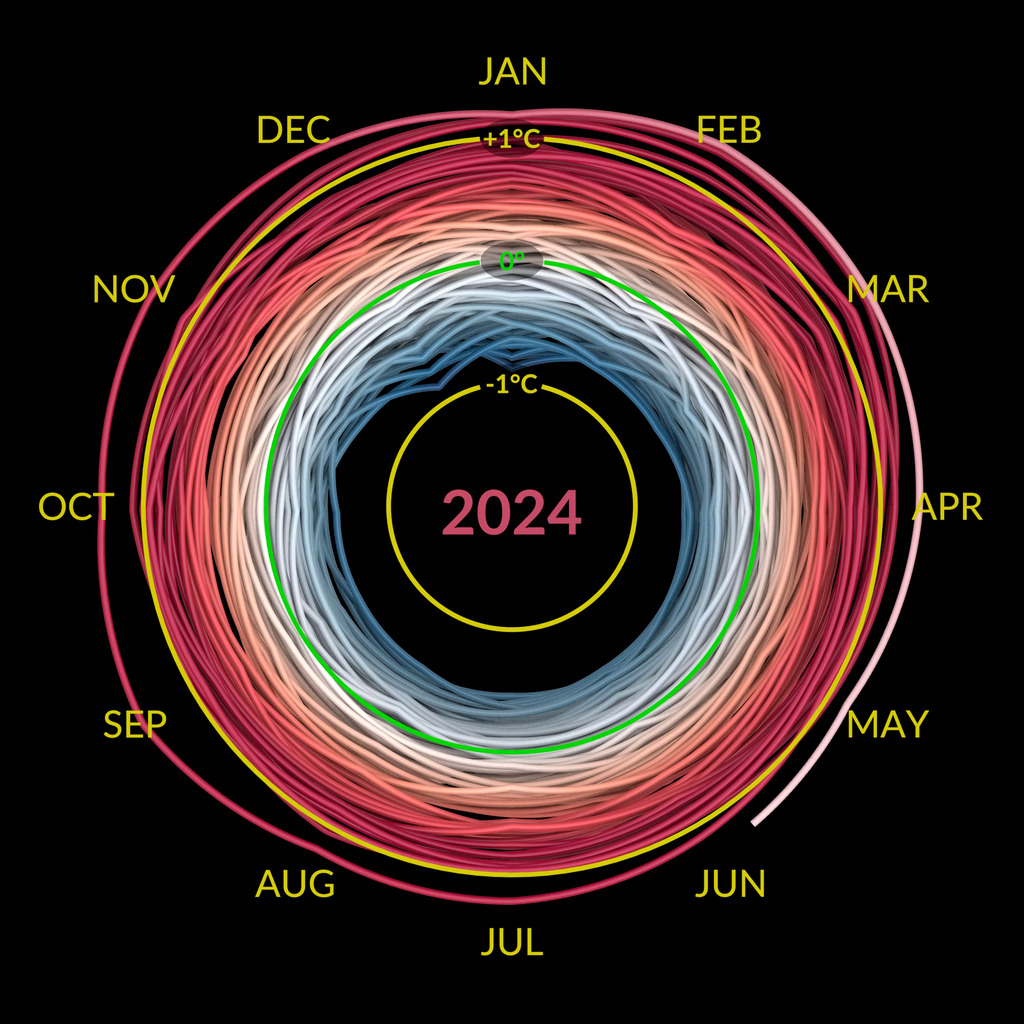
Slow reveal graphs are an instructional routine using scaffolded visuals and discourse to help students (in K-12 and beyond) make sense of data. This is a slow reveal graph of the SVS visualization of NASA Climate Spiral.
Slide #1 - just the animated spiral
Before playing, ask students what they notice and what they wonder as they are watching.
Play it through several times before having the group share. Depending on your group, have them share with an elbow partner or small group first.
Slide #2 - Add the rings, no labels
- Before starting the animation ask, "What's been added?" "How might these circles help us understand the graph?"
- Play the animation several times with the circles, ask, "What did the yellow and green circles help you understand as you watched?" "Was this something you already knew?"
Slide #3 - Add the Months on the outer ring
Play this video at least twice
- "What does each ring represent?"
- "How many years do you think are in this data set?" Record estimates that students volunteer
Slide #4 - Add the Running Years in the center
- As you play this video (over and over) ask, "What's the first year of data?"
- "What's the last year of data?"
- "How many years does this data represent?"
- "What do you think the yellow and green circles are measuring?"
Slide #5 - Add the units to the yellow and green circles
- "Were you right about the data being represented?"
- "How might this graph change if the 'average' was taken ten years later, or represented just one year?"
- "What if that one year was 1950, or 1990, or 2010?"
- "How would you describe the Earth's average temperature over time after seeing this graph?"
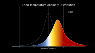
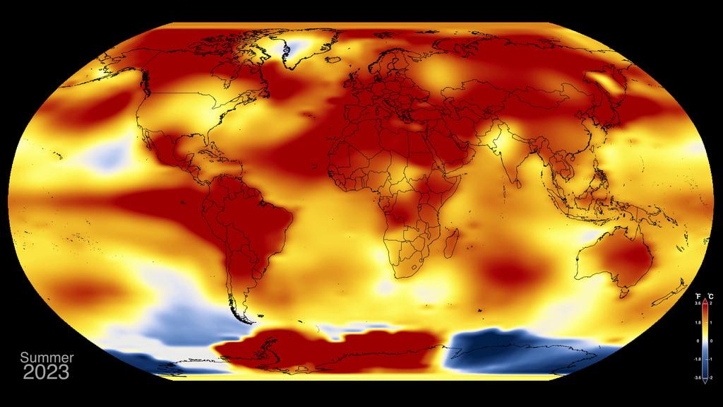
Explain to students that the data represents global temperature anomalies between 1880-2022. These are deviations from an average of the data between 1951-1980.
Slide #6 - Add The Twist
Before playing, instruct students to pay attention to what happens at the end
- "Describe what happened!" Have students share with a partner/group before sharing in large group.
- "What does this representation tell you that might not have been clear in the original?"

Slide #7 - Side By Side
- "Where did the months and years go from the circle to the stack?"
- "Which representation of the data do you prefer, and why?"
- "Pick one representation and describe something it 'tells' you that the other one doesn't"
- "Which is a more compelling and convincing representation?"
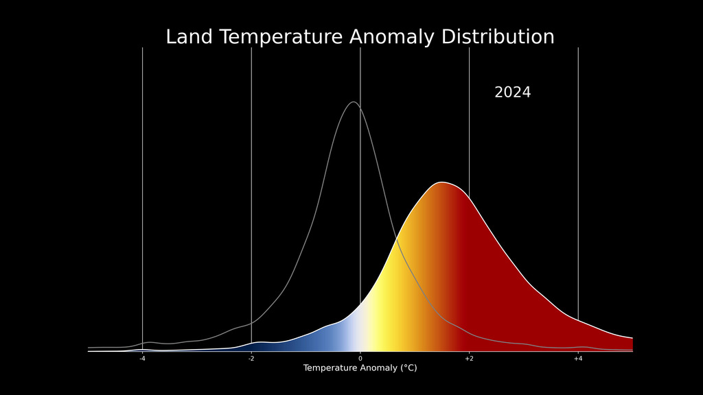
- This is an opportunity to note that deviations from average can be warm or cold.
"This graph represents 'anomalies', or deviations from the average. How would you describe these anomalies?
About this Graph
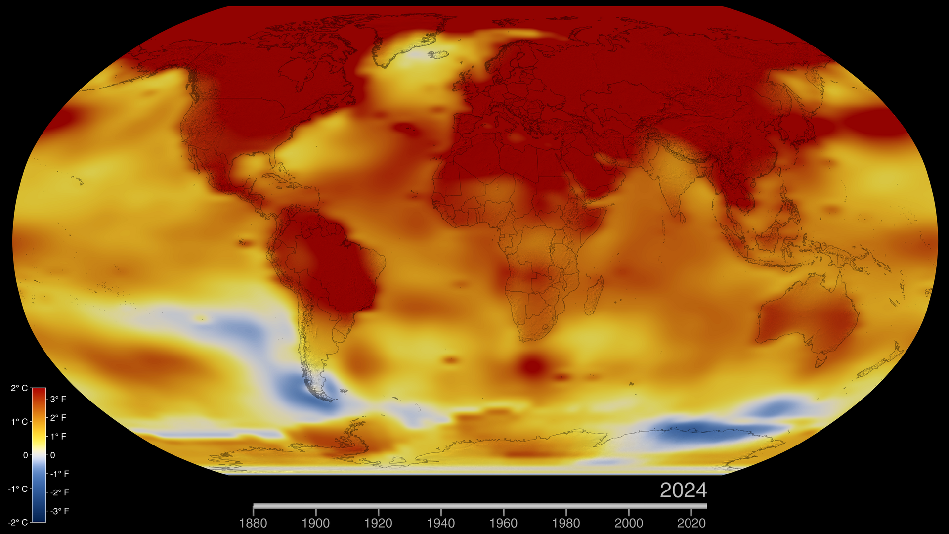
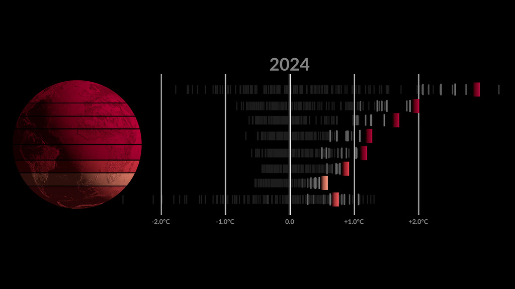
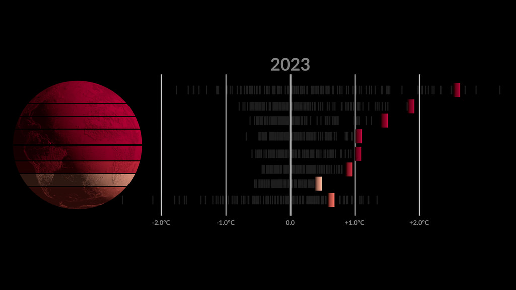
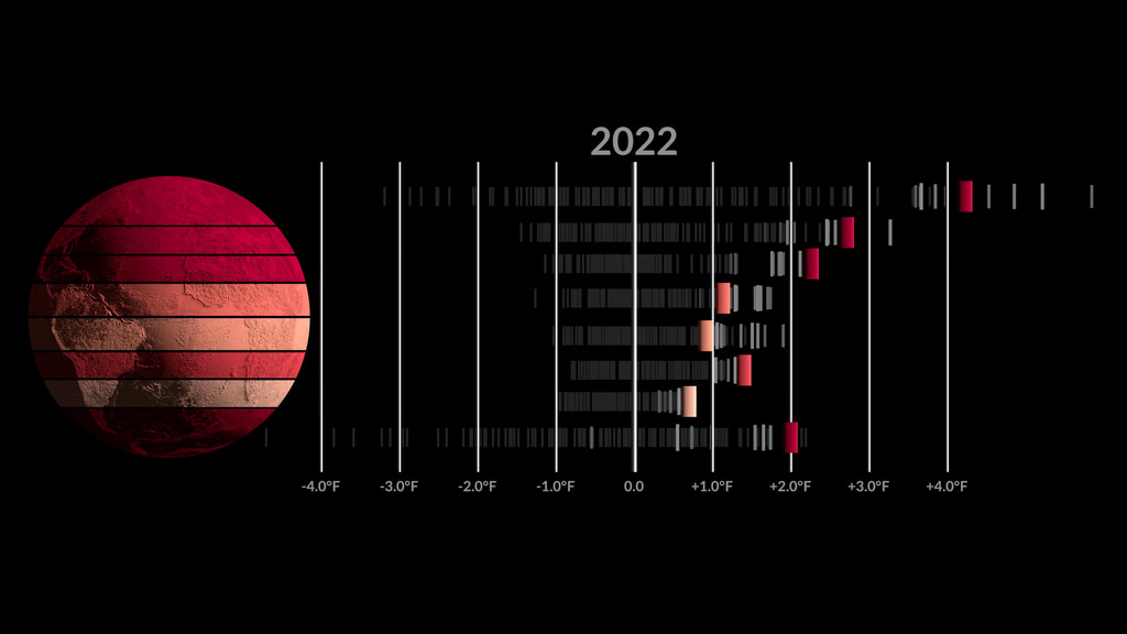
The visualization presents monthly global temperature anomalies from January 1880 to August 2024
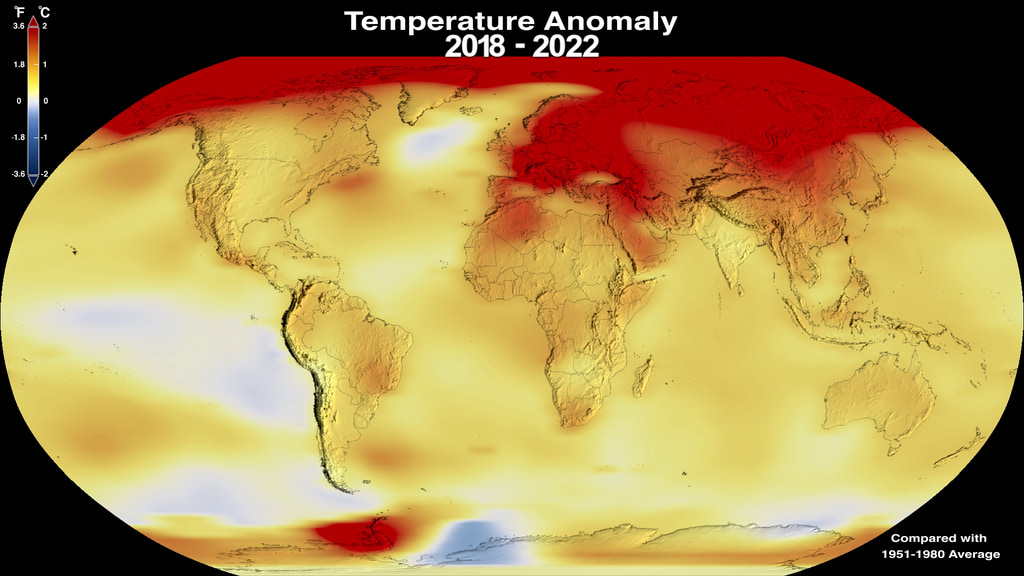
Temperature anomalies are deviations from a long term global average. In this case the period 1951-1980 is used to define the baseline for the anomaly. These temperatures are based on the GISS Surface Temperature Analysis (GISTEMP v4), an estimate of global surface temperature change. The data file used to create this visualization is publicaly accessible here.
The Goddard Institute for Space Studies (GISS) in New York is a NASA laboratory managed by the Earth Sciences Division of the agency’s Goddard Space Flight Center in Greenbelt, Maryland. The laboratory is affiliated with Columbia University’s Earth Institute and School of Engineering and Applied Science in New York.
Credits
Please give credit for this item to:
NASA's Scientific Visualization Studio
-
Visualizer
- Mark SubbaRao (NASA/GSFC)
-
Technical support
- Laurence Schuler (ADNET Systems, Inc.)
- Ian Jones (ADNET Systems, Inc.)
-
Web administrator
- Ella Kaplan (Global Science and Technology, Inc.)
-
Scientist
- Gavin A. Schmidt (NASA/GSFC GISS)
-
Science support
- Peter H. Jacobs (NASA/GSFC)
-
Producer
- Stacie Marvin (Maryland State Department of Education)
Release date
This page was originally published on Tuesday, September 17, 2024.
This page was last updated on Tuesday, September 17, 2024 at 3:34 PM EDT.
Datasets used
-
GISTEMP [GISS Surface Temperature Analysis (GISTEMP)]
ID: 585The GISS Surface Temperature Analysis version 4 (GISTEMP v4) is an estimate of global surface temperature change. Graphs and tables are updated around the middle of every month using current data files from NOAA GHCN v4 (meteorological stations) and ERSST v5 (ocean areas), combined as described in our publications Hansen et al. (2010), Lenssen et al. (2019), and Lenssen et al. (2024).
Credit: Lenssen, N., G.A. Schmidt, M. Hendrickson, P. Jacobs, M. Menne, and R. Ruedy, 2024: A GISTEMPv4 observational uncertainty ensemble. J. Geophys. Res. Atmos., 129, no. 17, e2023JD040179, doi:10.1029/2023JD040179.
This dataset can be found at: https://data.giss.nasa.gov/gistemp/
See all pages that use this dataset
Note: While we identify the data sets used on this page, we do not store any further details, nor the data sets themselves on our site.
